Oh, those cards! I'm definitely not the best at making them, but I do like to give my family handmade cards for birthdays and special occasions. Recently that's meant both Mother's and Father's Day cards for my parents, and I thought I'd share both of those here today.
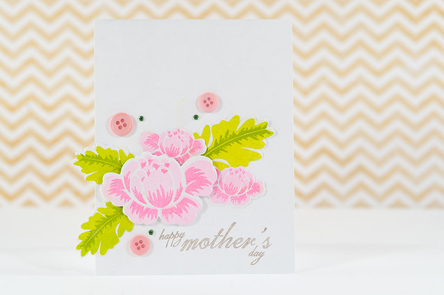
First up, Mom's Mother's Day card! For this one I pulled out some stamps that I bought long ago but hadn't used yet- Rosie Posie + Rosie Posie Step 2 by Papertrey Ink- along with the coordinating dies. The flowers were super, super easy to cut and stamp using the tiered stamp sets to add some darker highlights to the flowers. So pretty, and I'll definitely be getting more use out of this set!
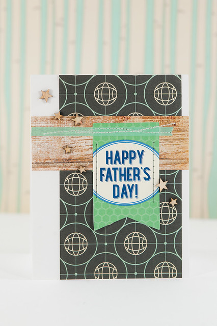
Dad's Father's Day card is more pattern-y with no stamping in sight, and it was completely inspired by the "Happy Father's Day" banner in the May monthly tag kit from Elle's Studio. I very nearly kept that tag to use in my Project Life album (hello, it has hexagons on it!), but Dad's worth it, so I gave it to him instead. :) The globe paper is from the kit that I pulled out to match the Oxford Lane collection by My Mind's Eye in my last Back to the Future post, and the woodgrain was pulled out of my scrap bin (I think it's from Crate Paper's DIY Shop).
Sometimes cards click for me, sometimes they don't. I'm so glad that the card making kung-fu was with me for this pair!
mother's + father's day cards
Tuesday, June 18, 2013
May Flaum had the awesome idea a few weeks ago to try neon paired up with gray on a layout, and I'm happy that she invited me along to play! You'll find another great project using this color combination over on her blog today, too!
Neon is one of those fads that I'm happy to play with in small amounts, but not really ready to buy lots of specific products for. Some trends like washi tape tend to stick around (no pun intended!) for a long time, but I think that neon definitely has a much shorter lifespan!
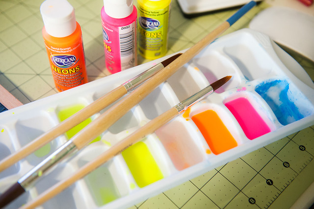
I've already shared one DIY neon project with you in my mist-making post a few weeks ago, and when May Flaum asked if I'd like to join her in some neon + gray project fun, I decided to pull out those same cheap neon paints and try a little watercoloring with them, too! And it turns out that plastic ice cube trays are much more suited for mixing watercolors than the tiny little plastic palette that I tried to use last time!
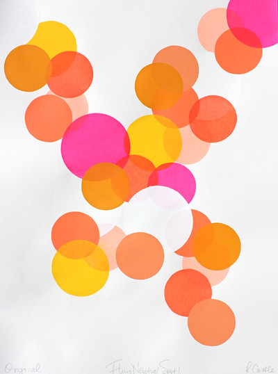
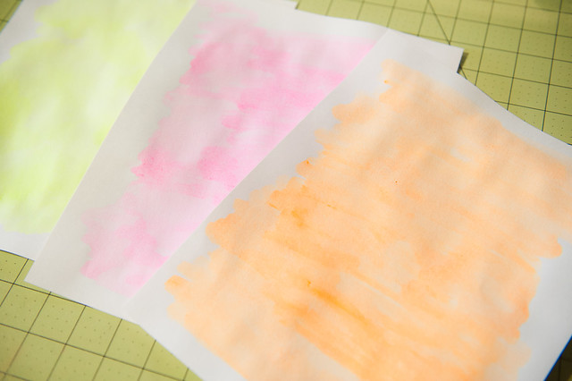
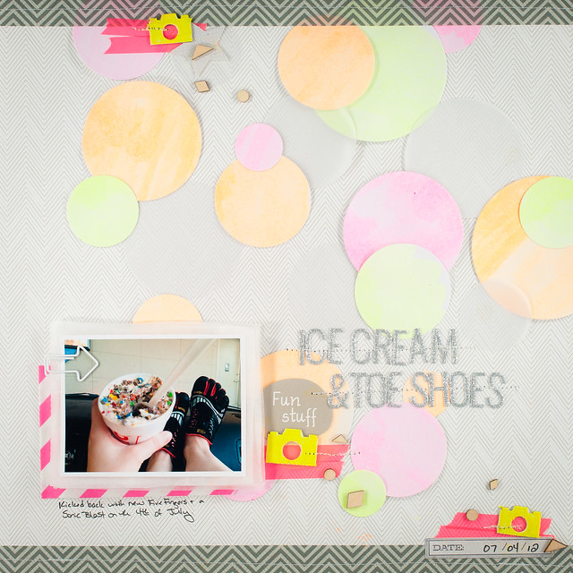
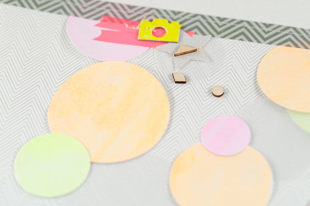
I was inspired by a piece of neon artwork that I first spotted on Pinterest (original source here), and I started things off by covering three sheets of plain cardstock (the cheap kind from the office supply store) with yellow, orange, and pink neon watercolors.
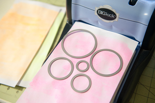
Making the circles was easy- I just ran the papers through my Big Kick using Lawn Fawn's Stackables Circles dies and had a variety of sizes in all of the colors in just a few minutes.
I played with the arrangement of the circles (adding in a few more cut from vellum scraps to add more neutral tones) on a gray chevron background for a few minutes until I was happy with the look, then added my photo, title, and some strips of washi across the top and bottom.
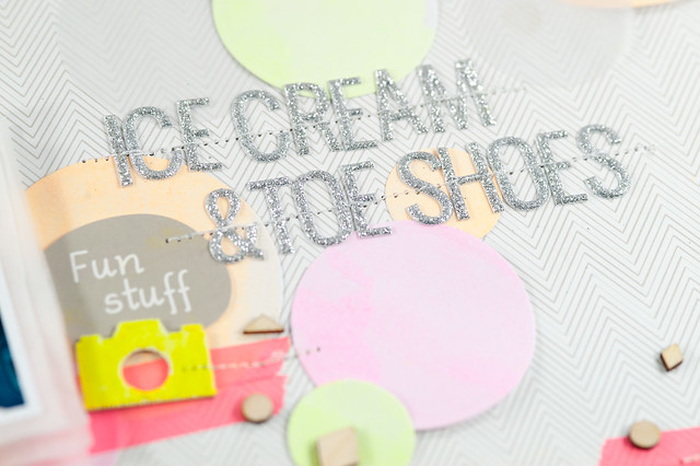
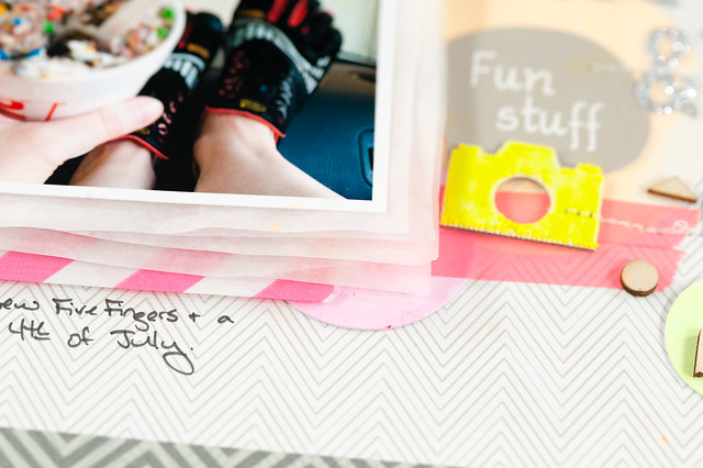
I don't have lots of pre-made neon embellishments on hand (just a few items from my Heidi Swapp design team days), but it was very easy to make a few pieces using the Hero Arts Neon Inks that I do have to color some mistable camera shapes. The pink neon washi was something that I actually picked up about 4+ years ago at Anthropologie when they had some small packs of MT tape on clearance. I don't think I'd actually used this roll yet!
Since the layout was starting to feel pretty 80's already, I threw in some wood veneer diamonds, circles, and triangles to finish off the embellishment clusters. It doesn't get any more "Saved by the Bell" than that!
Many thanks to May for giving me the idea to try out the fab color combination of neon and gray. It's awesome to have scrappy friends to nudge you to try out a fad once or twice before it passes for good!
Neon is one of those fads that I'm happy to play with in small amounts, but not really ready to buy lots of specific products for. Some trends like washi tape tend to stick around (no pun intended!) for a long time, but I think that neon definitely has a much shorter lifespan!
I've already shared one DIY neon project with you in my mist-making post a few weeks ago, and when May Flaum asked if I'd like to join her in some neon + gray project fun, I decided to pull out those same cheap neon paints and try a little watercoloring with them, too! And it turns out that plastic ice cube trays are much more suited for mixing watercolors than the tiny little plastic palette that I tried to use last time!
I was inspired by a piece of neon artwork that I first spotted on Pinterest (original source here), and I started things off by covering three sheets of plain cardstock (the cheap kind from the office supply store) with yellow, orange, and pink neon watercolors.
Making the circles was easy- I just ran the papers through my Big Kick using Lawn Fawn's Stackables Circles dies and had a variety of sizes in all of the colors in just a few minutes.
I played with the arrangement of the circles (adding in a few more cut from vellum scraps to add more neutral tones) on a gray chevron background for a few minutes until I was happy with the look, then added my photo, title, and some strips of washi across the top and bottom.
I don't have lots of pre-made neon embellishments on hand (just a few items from my Heidi Swapp design team days), but it was very easy to make a few pieces using the Hero Arts Neon Inks that I do have to color some mistable camera shapes. The pink neon washi was something that I actually picked up about 4+ years ago at Anthropologie when they had some small packs of MT tape on clearance. I don't think I'd actually used this roll yet!
Since the layout was starting to feel pretty 80's already, I threw in some wood veneer diamonds, circles, and triangles to finish off the embellishment clusters. It doesn't get any more "Saved by the Bell" than that!
Many thanks to May for giving me the idea to try out the fab color combination of neon and gray. It's awesome to have scrappy friends to nudge you to try out a fad once or twice before it passes for good!
Monday, June 17, 2013
Another Monday, another Project Life layout, this time with the June kits from Citrus Twist!
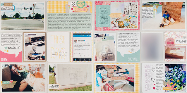
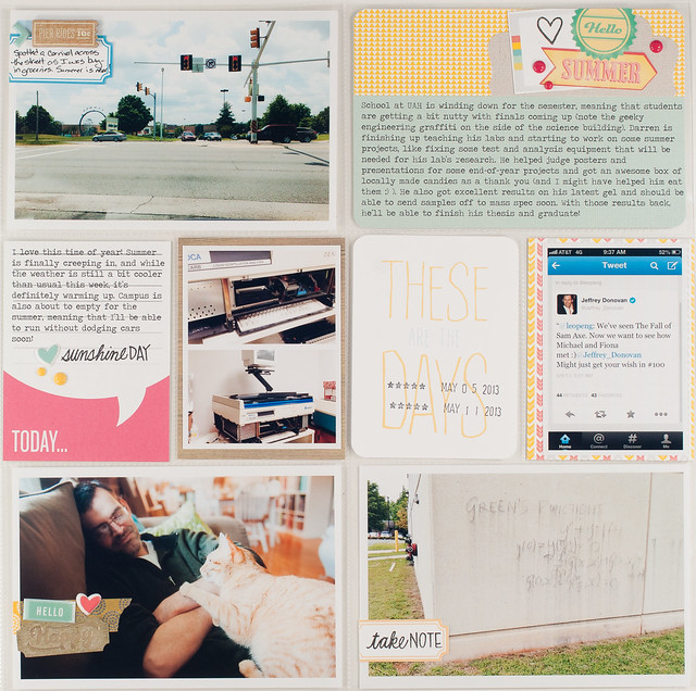
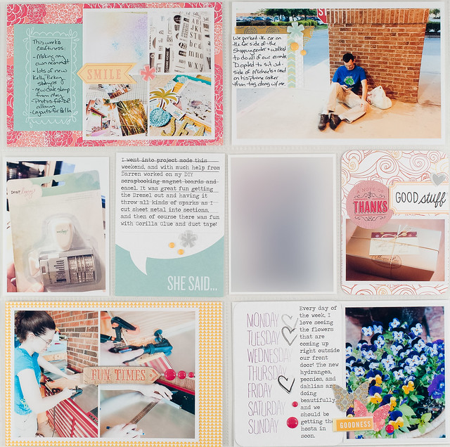
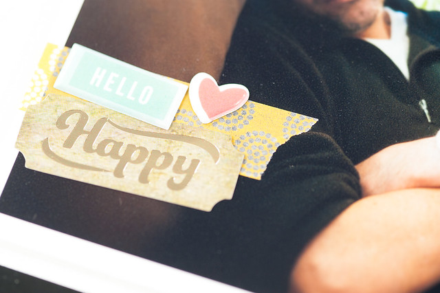
Week 19 marked the first full week of May. It's usually blazing hot (my favorite temperature, by the way!) by this point in time here in Alabama, but the weather was still doing its wacky weirdness and we kept having alternating days of slightly warm and slightly cool (note the fleece jacket worn by D in the bottom left photo) temperatures. By the end of the week there was definitely a warming trend, on, though- thank goodness!
As usual, I was able to capture little bits of this and that- lots of everyday things that wouldn't normally make it into my scrapbook albums. Like the Burn Notice tweet by Jeffrey Donovan, a random carnival in the mall parking lot across from the grocery store as I was running errands, and Darren opting to sit outside Michaels and read a book on his phone while I popped in to pick up some paint. Okay, that last one might eventually get its own page. :)
I also learned that I will indeed add layers to a Project Life layout from time to time. I usually avoid them to keep the albums from getting too bulky- I already produce about two and a half albums worth of Project Life layouts per year and do not want to make it three. Or 5! Layering a few flat items, like some thin stickers and a piece or two of patterned paper here and there doesn't really add too much. My rule of thumb is that anything chipboard thickness or less is good to go in my album. Thicker than that and I save it for a regular layout.
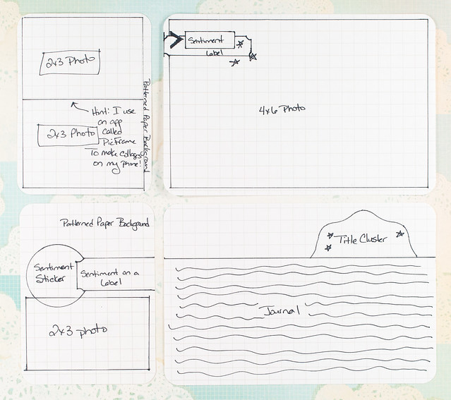
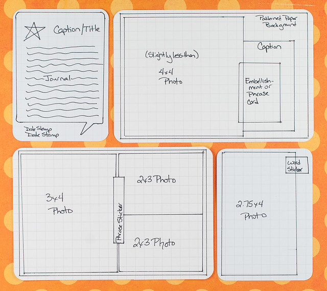
I've realized that I've been a bit remiss in sharing the Project Life sketches here that I've been putting together for Citrus Twist! Time to play a little catch-up, so here are the sketches for my June Project Life layout:
And also May (layout here)...
and April (layout here).
Happy Monday, everyone! Thanks so much for stopping by!
Week 19 marked the first full week of May. It's usually blazing hot (my favorite temperature, by the way!) by this point in time here in Alabama, but the weather was still doing its wacky weirdness and we kept having alternating days of slightly warm and slightly cool (note the fleece jacket worn by D in the bottom left photo) temperatures. By the end of the week there was definitely a warming trend, on, though- thank goodness!
As usual, I was able to capture little bits of this and that- lots of everyday things that wouldn't normally make it into my scrapbook albums. Like the Burn Notice tweet by Jeffrey Donovan, a random carnival in the mall parking lot across from the grocery store as I was running errands, and Darren opting to sit outside Michaels and read a book on his phone while I popped in to pick up some paint. Okay, that last one might eventually get its own page. :)
I also learned that I will indeed add layers to a Project Life layout from time to time. I usually avoid them to keep the albums from getting too bulky- I already produce about two and a half albums worth of Project Life layouts per year and do not want to make it three. Or 5! Layering a few flat items, like some thin stickers and a piece or two of patterned paper here and there doesn't really add too much. My rule of thumb is that anything chipboard thickness or less is good to go in my album. Thicker than that and I save it for a regular layout.
I've realized that I've been a bit remiss in sharing the Project Life sketches here that I've been putting together for Citrus Twist! Time to play a little catch-up, so here are the sketches for my June Project Life layout:
And also May (layout here)...
and April (layout here).
Happy Monday, everyone! Thanks so much for stopping by!