pretty little studio design team

Saturday, June 30, 2012

I woke up this morning to a fun surprise in my email inbox- I've been selected for the Fall/Winter 2012-2013 (ha! that's a mouthful!) design team at Pretty Little Studio! The announcement messages actually went out a little after midnight my time (just after 10pm by Pretty Little Studio's west coast time), and I was already sound asleep, getting ready to run a 5K this morning (more on that later), but it was an awesome way to wake up today!

I'm so excited to see some familiar names on the list- so many talented ladies, some of whom I've had the pleasure of working with in the past and others I'm just now meeting.


I discovered this small, independent company just a couple of months ago and fell madly in love with their "fresh vintage | whimsical fun" style. Owner Melissa Ross's designs are simply amazing and remind me of my favorite things about Sassafras and October Afternoon, though this company definitely has style of its own. Just check out their last two collections- Sand Castle and Monsieur. Aren't they so darling and fun? I'm going to have a blast working with them for the next six months!


My term won't begin until September, but starting then you'll be seeing a lot more of this fantastic company here on the ol' blog. I'm so looking forward to it!

lily bee blog hop | neon + a burn notice story

Friday, June 29, 2012

 
Good morning (again!) and welcome to my stop on the Lily Bee Blog Hop (you should have arrived here from Melissa Mann's post, and if you find yourself lost you can always start back at the beginning at the Lily Bee blog). I'm not going to lie to you, I may have the wackiest post of them all today, but if you know me, you know that wacky comes naturally. So, situation normal, right? Today I've got both a project and some info on a fun giveaway to share with you. We'll start with the project, and then the giveaway info is at the end.

The wackiness of this post and the project I'll get to in just a minute started last Friday when I spotted a fab color combination on The Sweetest Occasion (I adore that blog!) and instantly had that feeling that I had to design a layout around it. And with this palette of neon yellow, lime green, and aqua, can you really blame me? (I'll admit, I've got a full-on obsession with neon and white going right now.)


The only problem was that I didn't really have any photos on hand that I thought would really work with this color scheme, and I'm not a fan at all of converting my photos to black and white to make them match products. I 
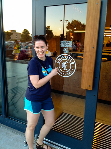
had recently eaten lunch at a place, though, that I knew would produce the perfect photos for the page, so I shot Darren a quick text message to ask if he wanted to have lunch at Lime Fresh Mexican Grill on Saturday (and of course he was totally up for it). That's the first wacky part of this whole story- yes, I did indeed plan a weekend lunch around my need for photos.

Lunch was had, photos were shot, and shortly thereafter I sat down to work on my page. Now, Lily Bee doesn't exactly have any neon prints in their paper lineup, but there are plenty of yummy lime greens and aquas to go around. In fact, Lily Bee is one of my favorite manufacturers to turn to when I need to work with papers purely on a color basis (you can read more about that and see the whole rainbow of Lily Bee's releases from the last CHA 
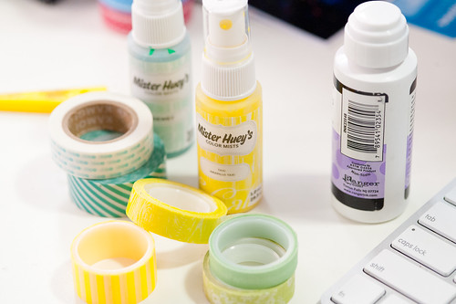
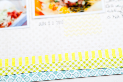
here). Within a few minutes I'd pulled several sheets of aqua and green paper that I thought would work, along with a selection of washi tapes (some neon and some just really bright) and a couple of the brighter (but again, not really neon) shades of Mister Huey to help things along. I ended up not using quite everything that I pulled out, but I wanted to err on the side of having too much in front of me rather than end up not using something just because I'd forgotten that I had it.

DSC_6510.jpg

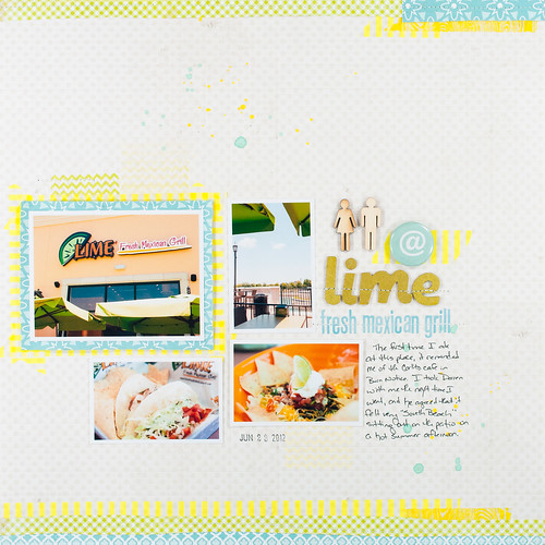
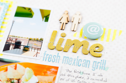
A little while later (with the addition of some Thickers and a few Studio Calico embellishments), this layout was born. It's not quite as bright and day-glo as the inspiration image, but I wasn't really going for full-on neon- just a little taste (which the Heidi Swapp washi provided rather nicely).

DSC_9402.jpg

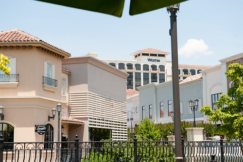
Okay, so now for wacky part number two of this story. Lime Fresh (or is it just called Lime?) has this very Miami/South Beach vibe about it (which is expected since they originated in, well, South Beach). In fact, sitting out on the patio under an umbrella on a hot summer day (we're having temperatures at and above 100 degrees Fahrenheit at the moment), you'd swear you were eating at some place straight out of a scene from Burn Notice. In fact, I said as much to Darren, who very nonchalantly replied, "it's no wonder you think that- Westen's right over your shoulder." I was puzzled for about 3.2 seconds until I remembered that the Westin hotel was indeed right behind me, visible just over my shoulder from where we were sitting. Ha! Funny boy.

I'm convinced that strangers would have one of two reactions to spending any amount of time with us. They would either a) join in with the wackiness and just roll with it or b) run screaming in terror. I tend to think that b would be the more popular choice...

DSC_6486.jpg

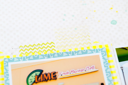
Anyway, getting back to the layout- I wanted to point out a few little details. Like the washi tape frame behind the aqua paper that shows just a little peek of neon without it being overwhelming. The stamped chevrons help, too, and are inked with a very bright (but not neon) shade of yellow (Daffodil) by ColorBox. Though if you're into neon inks, you might want to...ahem...check back here in a couple of weeks...just sayin'. ;)

DSC_6506.jpg

I could not for the life of me find a shade of letter stickers that I liked for my main title. I wanted a sort of chartreus-y lime-y green, but everything I had was way too green or just the wrong shade altogether. Then I remembered a post on the Studio Calico message board by Kinsey Wilson a few months ago when the new Mister Hueys were released...she'd discovered that if you misted bare chipboard (like the Hatbox chipboard Thickers below) with the Taxi (bright yellow) Mister Huey, they would indeed turn a sort of chartreus-y lime-y green. So perfect! Thanks, Kinsey!

DSC_6505.jpg


DSC_6509.jpg

And now that I've made you sit through all my ramblings, it's time to get to the giveaway, right?

I mentioned earlier this week that the Lily Bee blog has a new home at http://www.lilybee.typepad.com/...


...and in celebration of that, Lily Bee is giving away a fabulous prize. It's not paper or stickers or stamps...instead, they're giving one lucky winner a $50 Visa gift card to spend however they would like! To enter, you need to leave a comment on each hopper's blog and on the main Lily Bee blog (that's a lot, I know- I'm sorry, I didn't make the rules this time :(, usually my giveaways are really simple). Comments will close at midnight on July 2nd, 2012, and the winner will be announced on the Lily Bee blog on July 4th, 2012.

Cindy Liebel's blog is the next stop on the hop, and she's got another fantastic (though perhaps slightly less wacky than mine) project to share with you!


Supplies (click on images for product links):


friday favorites | june 29, 2012

Friday Favorites before morning coffee? Really? And by morning coffee I mean yours, of course, because coffee is one drink you never ever want to give to me. Unless you like having your sock drawer alphabetized and your car engine detailed. With a Q-tip. I'm seriously hyper enough without the coffee! So, why so early? It's because there's a Lily Bee blog hop coming up just a little bit later this morning, and I wanted to go ahead and get Friday Favorites up ahead of that.

And before I launch into this week's favorites, I have to share with you the most exciting news (and it has nothing to do with scrapbooking)...Huntsville finally has a Chipotle!!! We went for dinner on opening day, and it was fantastic, of course.

IMG_2070.jpg

Yes, after years of only being able to chow down on their amazing food while on travel, I now have one a mere ten minutes from the house. So cool! In fact, I was laying awake in bed the other night at about 10:30, and I very quietly said to Darren, "you know Chipotle is still open..." 

And, oddly enough, this is not the last time today that you'll be hearing about burritos, tacos, and other assorted yummies from me, because my Lily Bee blog hop post has a bit of the south-of-the-border taste going on, too...but from an entirely different establishment. Please don't tell Chipotle, but in their absence I'd been seeing other Mexican restaurants.

So, now that I've typed all of that out (and made myself hungry for a steak salad with guacamole when Chipotle won't even be open for another 6 hours), it's time to get on with this week's picks!

 
From the top left:
  • Rebecca Cooper shares a quick list of travel photography tips on her blog, Simple as That. She also posted a downloadable checklist of travel photos.
  • Celine Navarro posted a video tutorial showing the creation of this lovely textured layout from start to finish on the Studio Calico blog.
  • Take a peek inside Vee Jennings' craft space at Craft Storage Ideas.
  • This gorgeous watercolor doily gift wrap was posted as part of the Color Me Pretty feature at Decor8.
  • Check out the tutorial for making these fruit balloons at Oh Happy Day.
  • Wendy Sue Anderson shared a quick tip for stitching with baker's twine on the Create blog.
  • Scrapbook and Cards Today posted a great tutorial by Emily Pitts showing how to layer mists.
  • When I first spotted photos of this lovely, colorful hotel on Nayda Rocha's blog, I wasn't quite sure where it was (since I don't speak Portuguese at all), but I've since learned from Mint that it's the Saguaro Hotel in Palm Springs, California. This one is getting added to my must-see list for sure!
  • Learn how to make these watercolor flowers at GCD Studios.
TTFN!

green frog studio layout | elyse & zack

Thursday, June 28, 2012

DSC_6131.jpg

The Holga add-on from Studio Calico's May release was an absolute perfect match for the little photo shoot I did for my niece before her prom. You know, the one that involved me dashing over to the lake on campus right after a BodyPump class at the gym, meaning I showed up in a Star Wars t-shirt and toe shoes! I honestly haven't played with this kit as much as I wanted to (life got cray-cray in May, yo), so when my turn to scrap the example layout for the latest sketch over at Green Frog Studio rolled around, I jumped at the chance to get everything out and go nuts!

DSC_6134.jpg

The crazy thing about this layout? It uses a little bit from all the add-ons (and a few shop items), but nothing from the main kit, 35mm! I'd say those add-ons were a good investment. I even stamped and heat embossed on the background in lieu of my usual mist splatters. The stamp itself is from the Brownie add-on, which is the only one that's still available.

DSC_6133.jpg

DSC_6132.jpg

I love, love, love getting this kit every month again. It's changed the way I shop completely, and for the better. Now I buy add-ons and coordinated shop items instead of the random here or there, and I'm way less tempted to just pop into JoAnn, Michaels, or Hobby Lobby to see what's new. Not only that, but it's making me better about actually using what I buy- a total win-win!


Supplies (click on images for product links):


the new lily bee blog!

Wednesday, June 27, 2012

There are fun changes afoot at Lily Bee Design! Not only have they moved to a new blog that allows for more features (such as galleries of ideas for each collection), but there's also now a fan Flickr group and a new Pinterest group to help keep you inspired!


Be sure to head on over and check out all the changes, and if you subscribe to Lily Bee's blog in an RSS reader or subscription service, make sure you change the feed address to the new blog at http://www.lilybee.typepad.com/. You won't want to miss the sneak peeks of the new collections that are coming out at the CHA Summer show in a few weeks! "Collection 1" (which has not been officially named yet) was already peeked yesterday, and there's more to come!


See you there!

bella blvd layout | determined

DSC_6069.jpg

Just like I can't run every 5K as fast as I would like, not every layout I make is perfect.

But I'm always determined to do better at both.

DSC_6077.jpg

I'll be the first to admit that this page that I made, attempting to show a grungier side of Bella Blvd papers, perhaps didn't turn out quite as I'd intended it to. Actually, I think I was okay up until I added the gesso. And honestly I actually did like the page when I was finished, but now that I've had a few weeks to dwell on it...maybe not so much. :) But, just like the race it documents where I almost, but not quite, came in under 27 minutes, the layout almost, but not quite, lives up to what I originally set out to make.

One of the things I do really like about this page is how the title turned out. I took a cue from Lisa Truesdell's washi-backed words from a recent post on the Two Peas blog and used some of Bella's Designer Tape (torn in messy strips) behind a phrase that I cut on my Silhouette using the Blackout font.

DSC_6062.jpg

DSC_6063.jpg

DSC_6071.jpg

DSC_6070.jpg

Some layouts are instant classics, and some are ongoing lessons. And I've learned that sometimes even the ones that I'm not so fond of are actually the ones that my readers end up loving, so in the end it's all good. :)

And maybe next time I'll step away from the gesso...


Supplies (click on images for product links):


CopyRight © | Theme Designed By Hello Manhattan