Friday Favorites - February 28, 2014

Friday, February 28, 2014

I had this post all ready to go, and then nearly forgot to publish it- oops!!

It's the last Friday in February, and I'm hoping that, when it leaves, it takes the cold weather with it! We're supposed to have warmer temperatures here this weekend, so I'll be outside soaking it up and getting a run or two in, for sure. I've also got some crafting planned, and I've rounded up a few links that have really inspired me lately (especially those gorgeous print and cut labels!).

Enjoy!

ff feb 28

From the top left:
  • Many, many, many thanks to Michelle Wooderson for posting the final pages of her December Daily album this month! I'm steadily working on mine, still, and it's awesome to know that I'm not alone in that. Plus, her album is just gorgeous!
  • I love altered books, especially when they have little binder rings inside them, and Kim Jefress put together a gorgeous one using the Heidi Swapp collection that's at Michaels right now.
  • Several people have asked me where I got the font used in my blog header, and I've had to tell them that I actually bought the template I'm using (Designer Blogs' $15 template section is pretty much the bomb-diggity), so I didn't source that one myself. I did recently run across a post on Oh Hello Dy with several similar (and free!) cutout fonts you can download, so hopefully that helps!
  • Kaitlin Sheaffer, the creative force behind Ormulu, has a set of free printable labels up on her blog, along with instructions showing how to print and cut them using the Silhouette Cameo.
  • Unfinished projects seem to be on many peoples' minds this year (I recently gathered all of mine and organized them), and Ali Edwards wrote a great post showing how she's assessing and attacking her unfinished projects. I want one of those bread racks that she has!
  • Marie Lottermoser's adorable scrapbook page that she made to hold her kids' Valentines would be a great idea for any holiday- I can just see one of these for Christmas cards!
  • Stephanie Bryan's idea for using a set of 6x8 pocket pages as a mini album on a 12x12 layout is absolute genius! Check out the details on the Glitz Design blog.
  • The colorfully organized fabrics in Olabelhe's sewing studio are so happy and cheerful!
  • This gift wrapping station started life as a bookshelf. See how it was transformed on I Heart Organizing.
TTFN!

Color Me - Hot Pink, Orange Peel, and Sugar Plum

Thursday, February 27, 2014

Color Me - Hot Pink, Orange Peel, and Sugar Plum

Image sources: Design Love Fest | Decor8 | Creature Comforts

Worspace Wednesday - The Perfect Paint Shelves

Wednesday, February 26, 2014

Please do not let the clean desktop in this photo fool you! I confess that I moved more than a few piles that were on it to the floor temporarily just so I could take this photo of my new paint shelves! I did not, however, change what was playing on my iMac- Stargate: SG-1 has been going almost nonstop in here for the last few months and has helped me get through the winter.

DSC_4721.jpg

I say "new" shelves, but in reality I've had these two for a very, very long time. My parents made them when I brother and I were little, and when I was in grade school we each had one in our rooms to hold McDonald's Happy Meal toys and other small treasures. Eventually after college I inherited Jon's shelf and have had the pair ever since. For the last few years they've been in my attic, just waiting for the right use in this house, and when I spotted this post on Infarrantly Creative with that awesome tall paint shelf (she also has instructions should you wish to build something similar), I knew they would be perfect to house my collection of craft paints, spray mists, and another arts-y mediums.

DSC_4729.jpg

Yes, I do realize that is an insane amount of Martha Stewart craft paint! I went a bit nuts one day when Michaels had it on sale for 30% off with an extra 25% off your entire purchase coupon going at the same time, making it well under a dollar a bottle. I do love painting with it and also use it to make DIY spray mists and my own watercolors, but I also think it just looks really pretty and consider it a practical part of the room's decor.

DSC_4732.jpg

I also have my embossing powders and spray mists on these shelves, and I'm already using them more now that they're so accessible. The mists I will be glad to use up and get rid of since I have so much trouble with the nozzles getting clogged- ugh! The little mini-misters that I use to mix up my own color sprays seem to be a lot better about that, plus each color gets made in such tiny amounts that they get used up quickly, anyway.

DSC_4738.jpg

Darren also recently hung that strip of pegboard that's hanging to the right of the desk, and I have some colorful ideas for what I want to do with it. As soon as it's done, I'll be sharing that in another Workspace Wednesday post!

Two Page Layout Process in Photos - "SWCVII Day One"

Tuesday, February 25, 2014

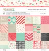
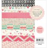
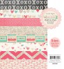
I decided to throw down a two-page layout while I was working with the February kits from Citrus Twist, using another stack of my photos from Star Wars Celebration VI. It's been a while since I made a two-pager, and I decided to take some photos of my process as I went along!

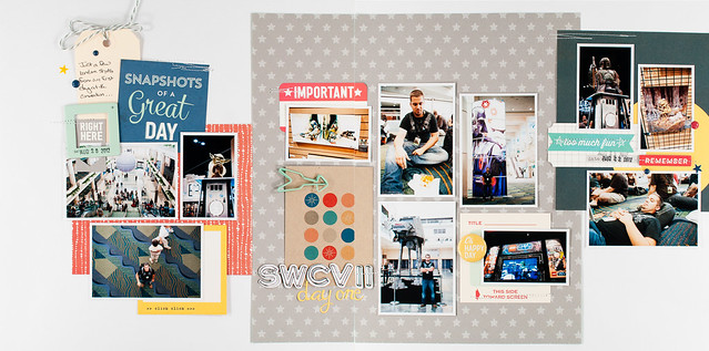
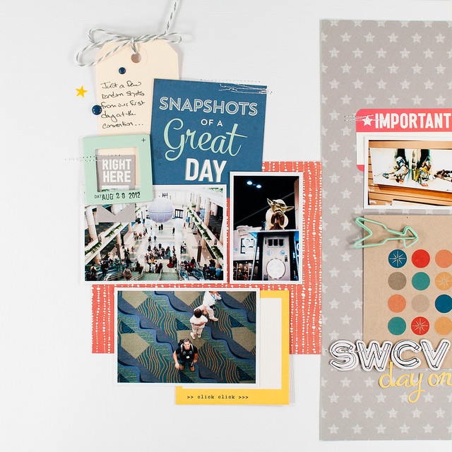
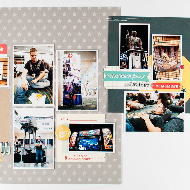
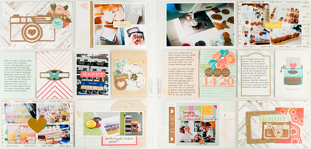
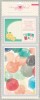
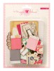
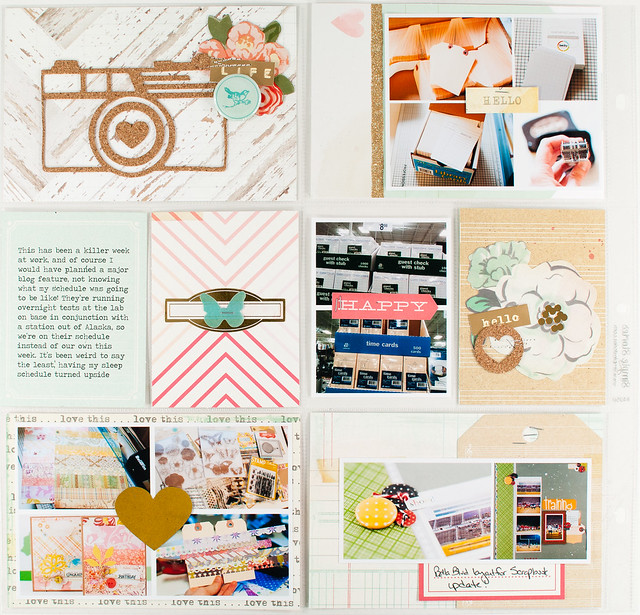
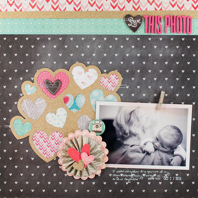
Before I dive into that, though, here's a peek at the finished product:

swcvii day one.jpg

After choosing photos for this page (meaning I simply pulled a pre-printed stack out of my 
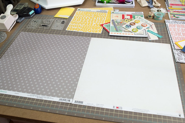
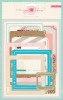
photo storage binder), I started my design by deciding on a layout background. I loved the way the star-printed paper from Elle's Studio looked next to a piece of white cardstock, and I really do like making two-page layouts where each side has a different background. I realized, though, that it would look very similar to the background of another two-page layout that I made for Two Peas last year, which wasn't a huge deal, except they would both end up relatively close to each other in the same album.

DSC_4541.jpg

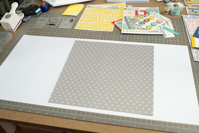
I changed things up by using two sheets of white cardstock instead. I cut the gray star paper down to 11.5" x 11.5" inches and placed it so that roughly 2/3 of it overlapped the right side of the layout, with the other third on the left.

DSC_4542.jpg

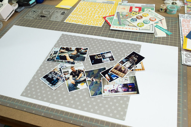
Placing the photos is the next part of my design process, and it's usually the part that a) takes the longest and b) can sometimes be a source of frustration if I can't get a design to work. I don't pre-plan photos and sizes before printing, and in fact when I originally sent these off to the developer, I'd envisioned them on 4-5 layouts of their own, using just 1-2 photos per page. I was really winging it to use these all together, but that's just how I roll with a two-page layout! The best advice I can give you if you want to similarly fly by the seat of your pants is to make sure to print a variety of sizes, mixing small, medium, and large, and to throw some squares in with all the rectangles. I wish I had done that here, but I worked with what I had.

DSC_4543.jpg

Sometimes with a two-page layout I design on a line, much as I did with that layout that I referenced earlier. Other times I start in the middle of the page and work my way out, balancing things so that one side has a few more photos than the other, both to add some interest and also because the emptier side is usually where the title and journaling ends up, so it's all balanced in the end.

DSC_4544.jpg

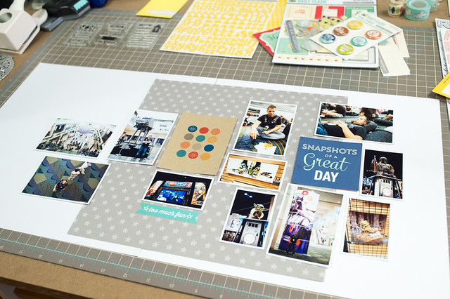
The photo above was my first shot at laying things out, and you can see that I've already identified a few embellishments and paper pieces that I want to use. This part of the process is really a lot of back and forth of trying to make some sort of a loose grid with my photos, knowing that I'll fill in any awkward gaps with more patterned paper and embellishments.

DSC_4545.jpg

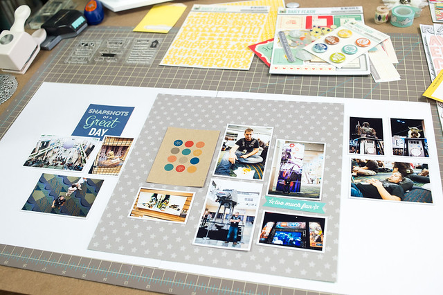
For my second run at a photo arrangement, shown above (as I'm working I take photos of each arrangement with my phone so that if I decide that I really did like one, I can always go back to it) I went with an approach that was a little more linear, but something still just wasn't gelling for me, so I gave it one last shot.

DSC_4546.jpg

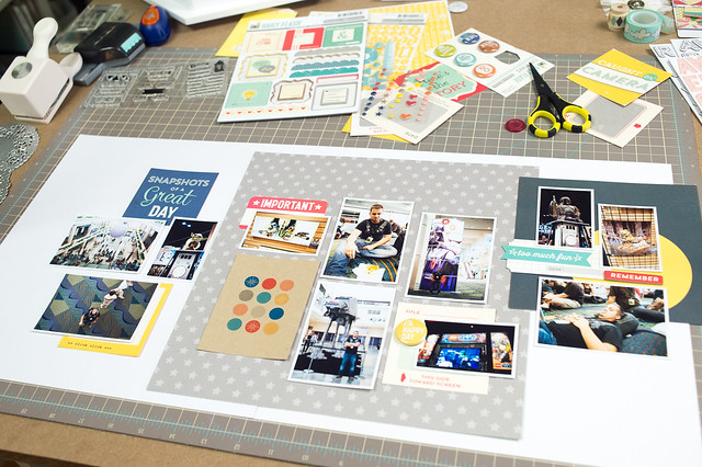
For this third (and ultimately final) arrangement, I split the photos up into three different groups, spaced across the page. I've used a similar type of grouping before, though with a slightly different background, on yet another layout for Two Peas- Merry Halloween. On that page I used the three different groupings to show the three different steps of our pumpkin carving exploits. On my current layout the photos don't have any real reason to be in groups other than I thought that the shapes worked well together, and the photos are all from the same day. You could also use this same grouping technique with more than three groups of photos- it's a really flexible arrangement.

DSC_4547.jpg

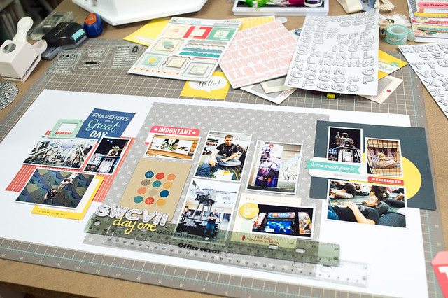
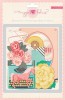
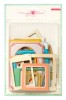
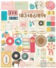
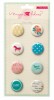
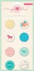
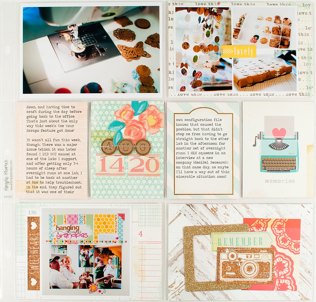
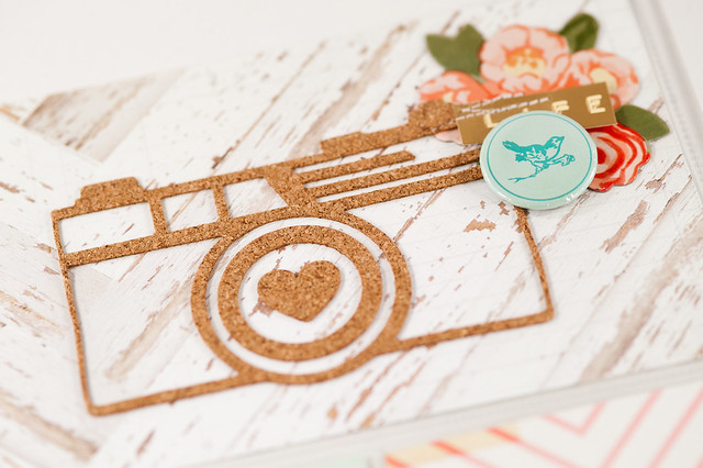
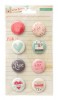
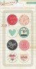
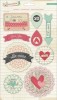
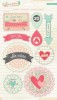
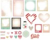
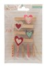
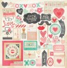
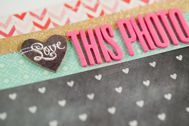
With the photos in place, it was time to start adding in more patterned paper and embellishments. In the photo above I've added a sheet of blue paper from the Citrus Twist Pocket Life kit's 6x6 paper pad, along with several small pieces from an October Afternoon cut-apart sheet and some die cuts from an Elle's Studio pack. In the photo below I've added another sheet from that 6x6 pad- this time in red- on the left page and have also added a title and started an embellishment cluster on the top left.

DSC_4548.jpg

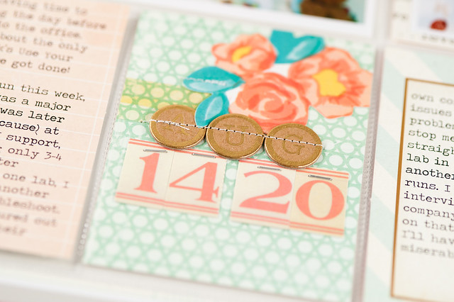
Once I have my photos in place, you can see that the final parts of the layout come together really quickly! I queued off of the circle print 3x4 card for my colors and tried to make sure that I included bits of aqua, red, blue, and yellow in all three sections of the layout to help with the balance.

swcvii day one.jpg

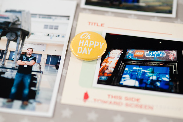
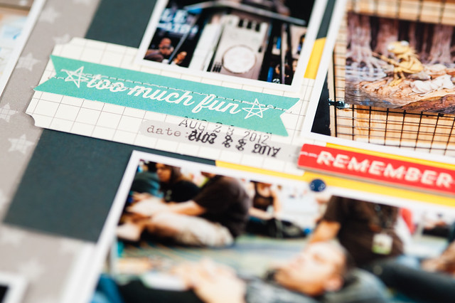
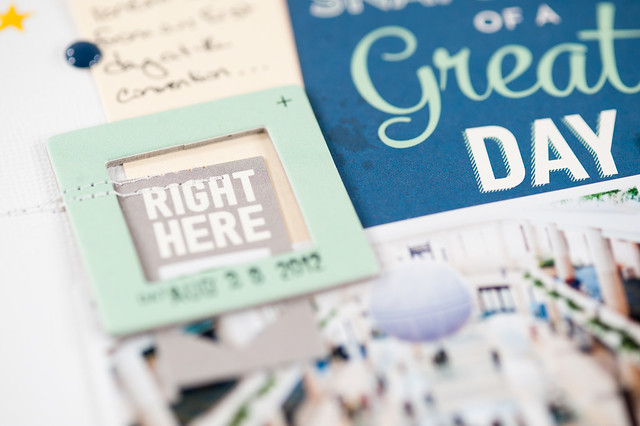
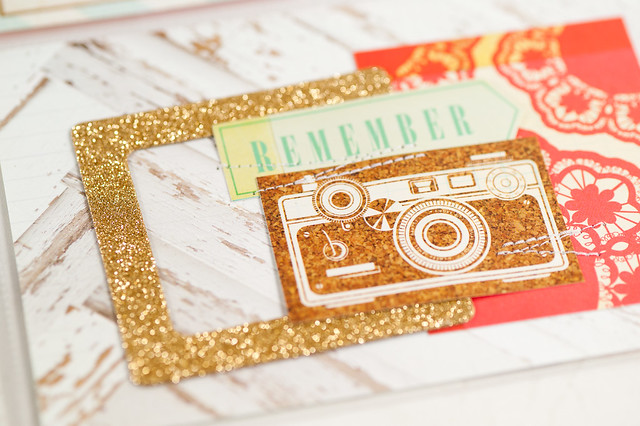
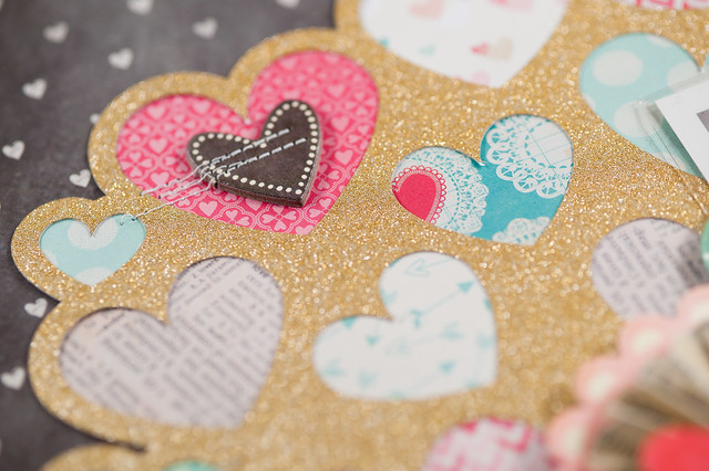
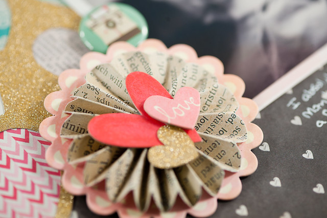
Here's a closer look at the left and right page, along with some detail shots.

DSC_0233-2.jpg

DSC_0234-2.jpg

DSC_5997.jpg

DSC_5999.jpg

DSC_6000.jpg

And that's how I go about making a two page layout! I used to find them intimidating, but I've learned in the last year or so of making them on my own (that is, without sketches), that the key for me really is a variety of photo sizes and just finding a photo arrangement that I'm happy with. I think if I tried to actually sit down and plan photo sizes for a layout before printing I wouldn't be nearly as happy as I am with this method, so "winging it" it is going to continue to be my go-to process!

Project Life 2011 - August 14-20

Monday, February 24, 2014

Last week and for the next several weeks I'll be sharing the remaining Project Life pages from my 2011 album. I've mentioned a few times before that I'm a bit behind on getting my photos from the end of 2013 and the beginning of 2014 edited and printed, but I'm making good progress on catching those up and will be sharing a couple of tips about how I'm making that happen soon.

Until then, I do have all of my 2011 photos printed and ready to go, and for this week's layout (covering August 14-20), I decided to use the new Styleboard collection by Maggie Holmes for Crate Paper.

project life 2011 - august 14-20.jpg

Supplies:


One thing you'll probably notice right away when looking at this layout is that it's a lot more embellished than what I normally make! That's by design, since as I was working on this page I was feeling like doing lots of layering and clustering. I actually really enjoyed that process, though at the end my pages did feel really busy. I think that's partially due to the 12x24 format, though, and the fact that it just has so much space to fill- just one of the reasons I'm excited to try the smaller 6x8 canvas for 2014!

DSC_0237-2.jpg

DSC_0238-2.jpg

One of my favorite parts of this page is the large camera that I cut using the Styleboard dies and my Sizzix Big Kick. The dies work perfectly with thin cork sheets, and though I've read about a few people having trouble with these, my cuts came out very nicely whether I used cork or paper. The cut on this page does have a slight tear on it, but that happened after it was cut and stuck down. I had originally placed that flair badge a bit higher, and when I removed it, a small section of the cork came off with it- ooops! Since much of Styleboard has a shabby feel to it, though, I decided to leave it as-is.

DSC_6021.jpg

DSC_6024.jpg

DSC_6022.jpg

This layout is an example of how I fill weeks where I don't have many photos- just play with the empty pockets! If you want more ideas for layouts covering timespans where you and your camera just weren't in BFF mode, I also put together a video lesson covering this topic during my time at Two Peas last year. You'll find that project here.

Thank you so much for stopping by today- have a happy Monday!

Geek Girl - February 23, 2013

Sunday, February 23, 2014

Hola, and happy Sunday, geeklings!

I'm a bit wiped after yesterday's IKEA trip- 4.5 hours of driving one way, lots time in the store, and I think than 80% of Ohio decided to shop there on the same day, to boot! We still managed to get everything we were after, but today Mom and I are just a bit tired. :)

The geek goes on, though, as always, and, in addition to today's roundup, you'll find a 49 page preview of the upcoming Han Solo standalone novel, Honor Among Thieves, over at Random House (click on the "Look Inside" button below the image of the book cover).  It's been quite a while since I had a new Star Wars book to read, so I'm looking forward to this novel's March 4 release.

gg feb 231

From the top left:

Tonight's video is a long-ish one,  but absolutely amazing to watch as Adam Savage (of Mythbusters fame) builds a replica of Han Solo's blaster.


MTFBWY!

"Love This Photo" Layout {Crate Paper}

Saturday, February 22, 2014

I actually almost never have Valentine's Day photos, unless you count the one of me holding a copy of Skyfall Blu-Ray that was last year's celebration, or maybe a photo of this year's grilled lobster (hey, at least it's red!), so any time I'm assigned a Valentine's themed layout, I more than slightly freak out (as explained here). Luckily Crate Paper kept things open when they handed out assignments using this year's Valentine's collection, Love Notes, and asked me to simply scrapbook on the topic "Love This."

DSC_0235-2.jpg

Supplies:


I thought through lots of things that I could have scrapped about- travel, home, and David Tennant's hair for starters- but settled instead on family, specifically a photo I took of my Mom and my little nephew Finnegan when he was just a week or so old. It was one of those photos that I originally thought was "meh" at best...until I changed it to black and white. Suddenly it took on a whole new character, and I loved it. I'm definitely going to have to try black and white more often!

DSC_6014.jpg

The design of the page was almost entirely inspired by this heart cluster cut file from the Silhouette Store. I cut it out of American Crafts' gold POW! glitter paper, then filled in each of the hearts with a little bit of pattern cut from the collection's 6x6 pad. By using them in tiny amounts, I was able to get lots of patterns from the collection onto a single layout without them being overwhelming, and I anchored it all on a neutral background.

DSC_6012.jpg

To blend the gold with the design, I added it in two more places on the layout. The gold heart on accordion flower above was actually one of the pieces left over from cutting the larger cluster, and the strip of gold across the top of the page creates a very loose visual triangle (extremely scalene, but a triangle nonetheless), so there's not just one big blob of gold on one section of the page. Repetition, baby!

DSC_6011.jpg

A couple of quick things to point out about the title above. First, the Thickers- I love this font, and I also love how Crate put two different colors of it (pink and cream) in the same package. I'm hoping they do more of that in the future. Second, I subbed in a chipboard piece with the word "Love" on it as part of my title. I seriously love Crate's 12x12 chipboard sheets- nobody does it like them!- and I'm super bummed that the new collections starting with CHA Winter 2014 come with thinner chipboard "packs" and not the nice, heavy sheets. I will certainly miss them, and I hope they decide to bring them back!
CopyRight © | Theme Designed By Hello Manhattan