pink paislee | basically bare blog hop layout

Wednesday, April 25, 2012

DSC_3903.jpg

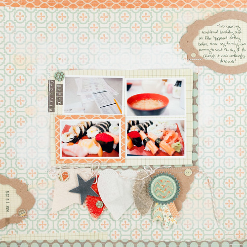
I call this one "The Layout That Got Done Twice."
DSC_8943.jpg

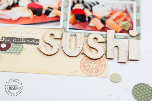
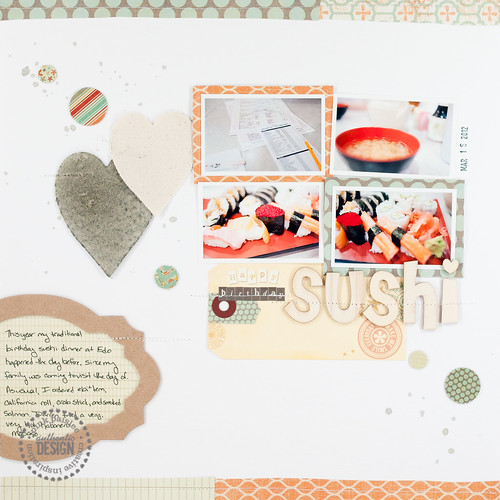
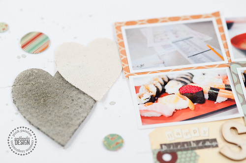
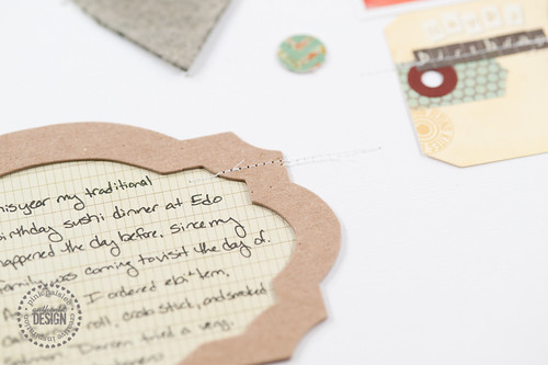
Okay, so, yes, it's also my Birthday Sushi layout that was up on the Pink Paislee blog on Monday as part of their week long blog exchange with Basically Bare, but it also has the distinction of being one of the few (perhaps the only?) pages that I have completely and totally redone from the beginning. I'll show you the one that didn't make it on the Pink Paislee blog (because I chose not to submit it) in a bit, but first I thought I'd show you the "good" version. :)
DSC_3902.jpg

DSC_3905.jpg

I'm not 100% sure what it was about this page that completely threw me the first time around, but I have a strong suspicion that I bowed to a bit of "product pressure." You see, those of us on the Pink Paislee design team who participated in the exchange were sent a fairly generous box of Basically Bare product- several mini albums and many, many packages of their raw chipboard, canvas, and felt embellishments. Even though I was assigned to do only one project with the product and told to just pick and choose whatever I wanted to use, I felt like I needed to put as much stuff as possible onto that one project. If you're familiar with my pages, you know that's totally not me- I love my whitespace!

I'm pretty sure there was also a bit of peer envy involved in this layout disaster, as well. I'm a fairly simple scrapper- not so much artsy or paint-y or ink-y (beyond my beloved mist splatters), but the Pink Paislee design team is filled with girls who are so good at those techniques. They layer. They paint. They spray mist (not just splatter!!). They use pattern anywhere and everywhere, and it works for them!

And then there's me. Simple. Whitespace. Photos. Bits of paper. Punched shapes. Journaling. Stitching. That, in a nutshell, is every layout I ever make. And I like it that way, because my pages suit my personality.

So, what happens when clean, whitespace girl feels she needs to "product it up" and be artsy at the same time? This disaster, my friends, is what happens:
DSC_8944.jpg

Yeah. No. There was no way I was sending that to Pink Paislee as fulfillment of my assignment. Not in a million years. To me it was too busy, too messy, and everything was crammed together in the middle because I was trying to fit lots of stuff on while still leaving whitespace. Except my whitespace was patterned paper, which wasn't working for me, either (and don't get me wrong, I love that paper!). So I put the page aside (no, I didn't destroy it- it's actually going in my album right along with the other one), took a break, and then came back and worked on rainbow-y goodness with the London Market chipboard buttons instead (you saw that page last week). And then finally I came back and made the page at the top of this post, and I love it!

So, be gone ye dragons of product pressure and peer envy! Next time they rear their ugly heads, I'll just fend them off with neutral cardstock and remember what May Flaum told me in the middle of my creative tantrum- Pink Paislee picked me for my style, not someone else's.

Just keeping it real, guys. :)


Supplies (click on images for product links):
project life 2012 | week 9 | featuring anthologie by we r memory keepers

Tuesday, April 24, 2012

As promised I'm back on track this week with my Project Life posts, though I'm still skipping around a bit on my weeks to work in some assignments and features.

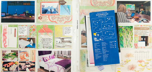
project life 2012 week 10_1.jpg

For this week I pulled out some of the new Anthologie line from We R Memory Keepers to work with. I was struck by the aqua, green, and coral color palette of this collection when I first spotted it at CHA in Anaheim earlier this year, and I was thrilled when the company sent me a 6x6 pad and a small selection of tags and embellishments to work with. If you're a current Project Lifer who uses the Amber edition kit, you might want to pay special attention to this one- the colors and patterns play so well with the existing Amber Project Life elements, and if you're looking to pick up something to spice up your album here and there, this line might be just the thing for you.

project life 2012 week 10_3.jpg

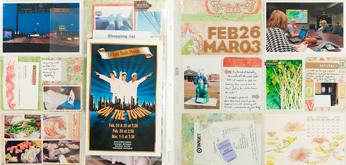
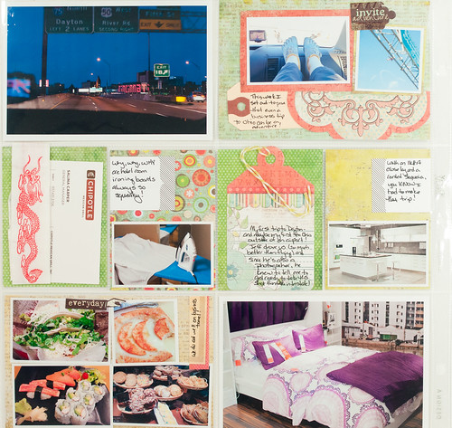
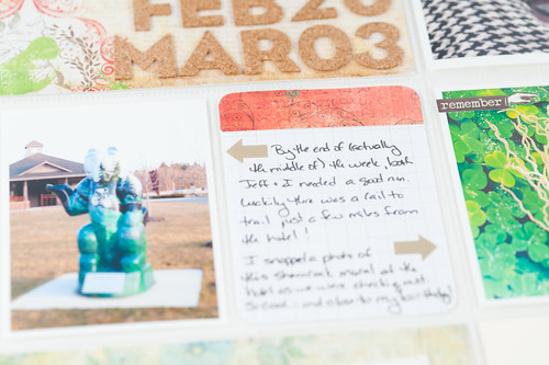
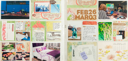
Week 9 chronicles a business trip that a coworker and I took to Ohio, and since we drove it was a true road trip! I always try to find fun ways to make business travel an adventure, and a trip to IKEA, a successful search for a good running park, and lots of great food actually made for a fun week when we weren't at the office. I love the Anthologie line's emphasis on finding beauty and adventure in the everyday and thought it would be the perfect collection to help capture the feel of this week.

I did have one 8.5x11 insert for this week containing a map from IKEA, a menu from a really good sushi place in Ohio, and the playbill from Darren's niece's senior musical. Unfortunately I was at work the whole weekend and not able to attend, but I included it anyway since Darren did go and it was such a big event for his family.

project life 2012 week 10_2.jpg

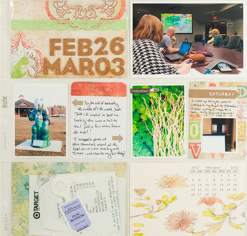
Here's a closer look at the left-hand page, which is full of details about the trip.

DSC_8924.jpg

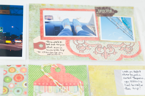
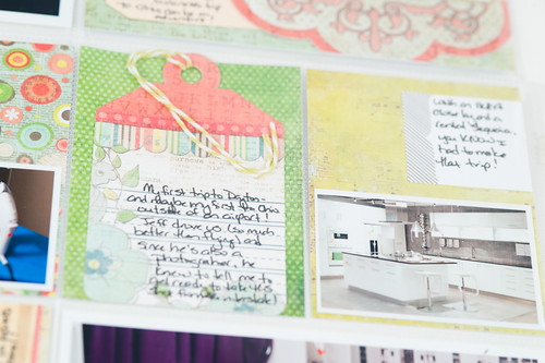
I found the Anthologie tags to be useful in several places on this spread, especially when cut into smaller pieces and used as decorative elements as I did in this pocket in the top right corner of the page.

DSC_3264.jpg

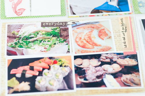
And the papers? Just gorgeous (and of course the 6x6 pad was just the perfect size for cutting down to fit the Project Life pockets).

DSC_3265.jpg

DSC_3266.jpg

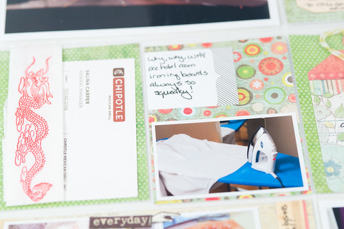
I had fun sprinkling some of the Anthologie stickers around my layout, too. Like I said before, I love the theme!

DSC_3267.jpg

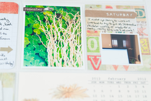
Here's the right-hand page, with a little more about the trip and then a few photos from regular life back at the office in Huntsville. I pretty much spent the whole weekend there, so this Project Life layout has the distinction of being the only one in my album so far that includes zero pictures from home.

DSC_8925.jpg

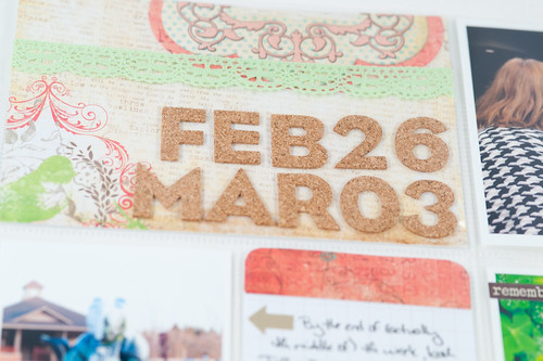
I used another half of an Anthologie tag along with some of the pretty crochet trims here on my title block. (The alpha is by Close To My Heart.)

DSC_3269.jpg

I dressed up a plain grid Project Life card with a small strip of the Anthologie paper- just a little touch to help pull some of the non-collection supplies on the page together.

DSC_3270.jpg

DSC_3271.jpg

I'm so happy to be getting back in the groove with this project. I'm currently up to date with keeping all of my photos edited, printed, and organized in 8.5x11 page protectors along with memorabilia, so at this point I can just pick up a week and scrap. And using different supplies every week? That makes it even more fun!


Supplies (click on images for product links):
CopyRight © | Theme Designed By Hello Manhattan