Scrappy Favorites: Crushing on Kraft
Wednesday, February 2, 2011
I love kraft cardstock. It's probably my favorite neutral because it works with almost any color palette and is a wonderful background for pages where black or white cardstock provides a bit too much contrast.
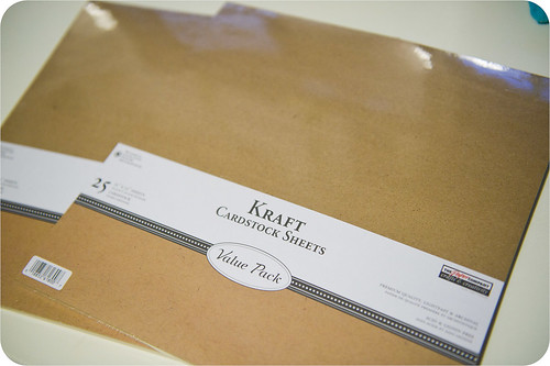
I still remember the first time I encountered kraft- in Studio Calico's December 2007 kit. Coincidentally, that's the same kit that I discovered mini alpha stickers in, so I'd say that club subscription was a good deal on many fronts. These days, though, I tend to buy my cardstock in bulk at JoAnn, where a 25 sheet 12x12 pack can be purchased for just a little over $3 when it's on sale (pictured above). The last time I found it for that price I stocked up (we didn't have a JoAnn in Huntsville then), buying I think 15-16 packs of it. At the time even I thought I was nuts for buying that much, but now that I'm down to five unopened packs I know it was a good purchase.
As I was browsing through my more recent layouts to find those that were suitable for my mini alpha stickers post, I found soooo many that use kraft as a background.
Like this one with its riotous color scheme. The kraft tones it right down without getting in the way.
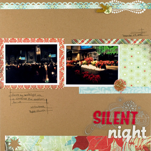
It works beautifully for Christmas layouts with a traditional color scheme...
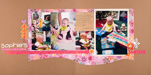
...and for nontraditional ones as well.
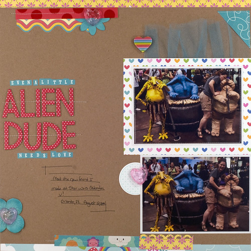
Here's another with some really bright colors (I also shared this on my mini alpha post). The kraft really lets those colors pop in a way that black or white just can't.
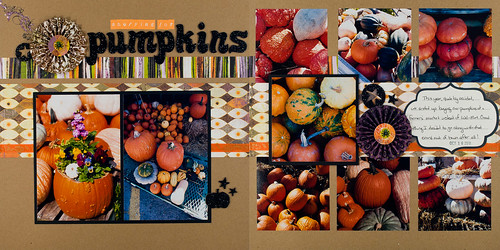
Sometimes kraft's warm brown in perfect for the subject of a layout, too. It blended beautifully with all the pumpkins I photographed last Halloween.
I love using kraft as an album base, as well. My first Week in the Life album (and my second, as well, if I ever finish it) have bases of all kraft. For albums that range in theme and subject, it's nice to have a neutral base to tie it all together.
Kraft is also going to the be the base for the Bahamas cruise album that I prepped for last fall. I'm planning lots of bright colors in that album both in the paper and the photos, so it'll be the perfect background.
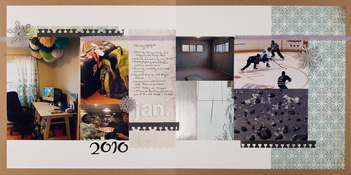
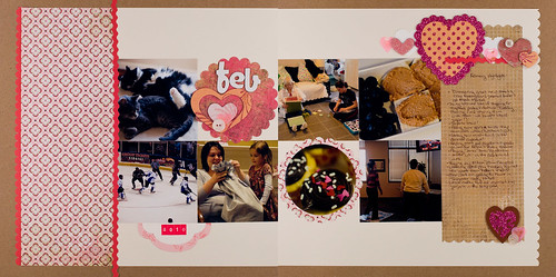
My Project 12 album also has a kraft base. You can see in the two pages below that even though the photos and paper colors are very different, the kraft background helps tie them together nicely.
So, yes, kraft is definitely my favorite color of cardstock, even though my Dad says I might as well scrap on the back of a grocery bag. :)

