scrapbook circle | project life 2012 | week 10

Monday, April 30, 2012

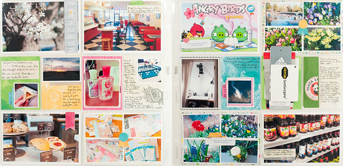
I've been scrapping Project Life layouts with Scrapbook Circle's kits every month since shortly after I joined their design team, so it seems right somehow that the final kit layout I'm sharing here on my blog before my term with them ends is Week 10 of my album.

For this particular spread I used the April kit, Daydreamer (which is now sold out!), which included lots of pretty, bright items from both Heidi Swapp's newest collections and also Amy Tan's Sketchbook line with American Crafts.
project life 2012 week 10.jpg

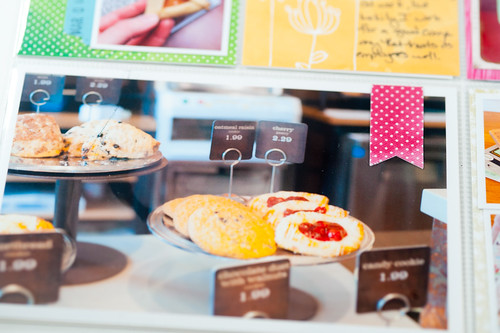
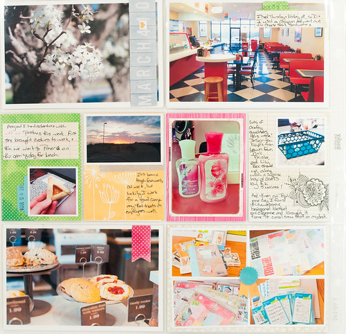
Here's a closer look at the left side of my layout, where you'll find pear trees in bloom (the first blossoms of spring!), yummy lunch treats, crafty fun, and adventures at a new restaurant where Darren tried his very first cheese steak sandwich. How is it that he's been married to me for 10 years and had yet to try to a cheese steak sandwich? Obviously I have deprived the boy.
DSC_8937.jpg

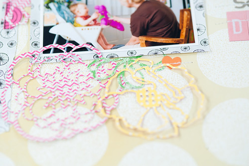
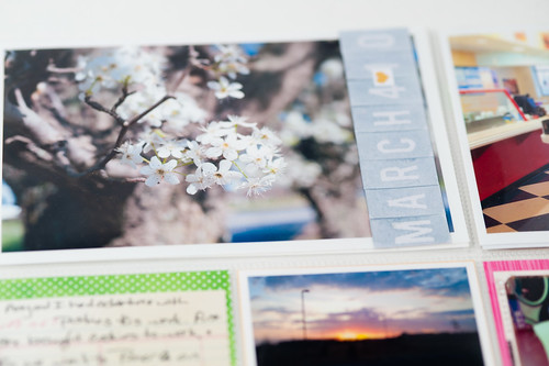
The Heidi Swapp Color Magic alphas in this month's kit made their way onto a couple of my layouts for April, including here where I colored them with Tim Holtz's Weathered Wood Distress Stain before adhering right over the top of my photo. There weren't any hyphens in the alpha set, so I cut a tiny little heart off of one of the "Like" stickers in another pack of Heidi embellishments from the kit and used it instead.
DSC_3599.jpg

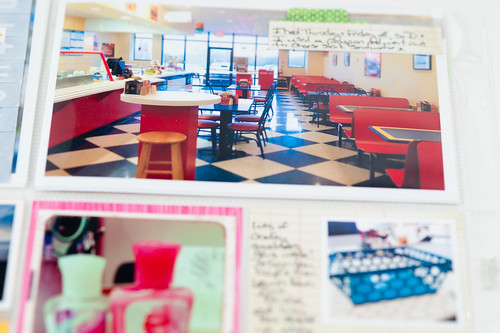
Sometimes when I look at other Project Life pages, I realize that I use a lot more 4x6 photos than some of the other artsy documenters do, but I've decided that's just my style! I like to use a big photo and then add journaling and maybe a little pop of color in some of the dead space in the image.
DSC_3600.jpg

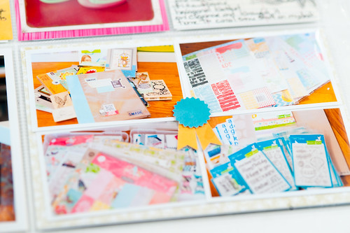
Documenting food and sunrises...two recurring themes in my Project Life album. I used the 6x6 Sketchbook paper pad in the April add-on this month for most of the backgrounds for these smaller photos. Punches (like the little tab I punched out and placed behind one of my photos in the picture below) are another great way to incorporate little bits of color into your pages.

DSC_3601.jpg

DSC_3602.jpg

DSC_3603.jpg

DSC_3604.jpg

On the right hand side of the layout you'll find Angry Birds, a trip to the Botanical Gardens, more stuff in bloom (this time at home), and a trip to the Korean market.

DSC_8938.jpg

Oh, and maybe a fortune cookie sentiment, too, held in place by a tiny Heidi Swapp heart. :)

DSC_3593.jpg

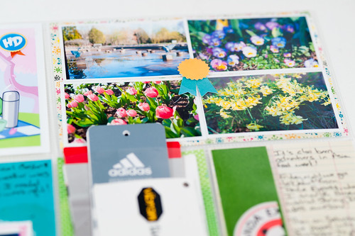
I used another punch along with the Sketchbook 6x6 pad to add a little something to the center of this photo cluster- a technique I repeated later on in this same page.
DSC_3594.jpg

The frame for this koi photo was cut from one of the larger sheets of Amy Tangerine Sketchbook paper that was included in the main kit.

DSC_3595.jpg

DSC_3596.jpg

DSC_3597.jpg

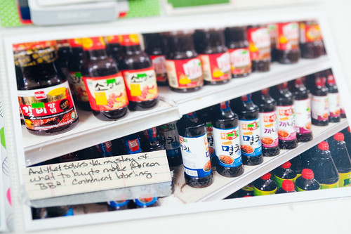
Funny story about the photo below...so once a year or so we go visit Darren's brother and his family. They're Vietnamese, and we looooove it when they cook for us, especially when they barbeque. For years they've made us a dish that they simply call "Korean BBQ," but for some reason my brain made it more complicated than that. I wanted to learn to make it at home, so I went online and learned that the actual name for it is bolgagi, and it requires a special type of sauce to marinate the meat. So one day Darren and I dropped by our local Asian market, and I prepared myself for a difficult search through bottles labeled in Korean, hoping that one of them would have the word bolgagi in English.

Turns out that some of them were labeled in English.

And you know what they said?

Korean BBQ.

::facepalm::

But it was delicious when we made it at home!
DSC_3598.jpg

I know I keep saying it, but every week I fall more in love with Project Life- so glad that I started this album!


Supplies (click on images for product links):
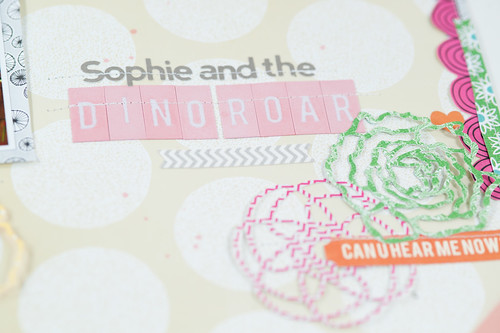
scrapbook circle | layout | sophie and the dino-roar

Tuesday, April 17, 2012

DSC_3609.jpg

The April kit at Scrapbook Circle is full of bright, happy, and even neon colors! Such a pretty combination, but I have to admit that it's a bit outside my normal palette (I love color, but seem drawn to more muted tones). The happy combination of Amy Tan's new Sketchbook line, Heidi Swapp's neon embellishments, and a bit of Lily Bee and Jillibean soup thrown in for good measure makes for a very playful kit, so I decided to step outside of the confines of my normal scrapping comfort zone and try a few "playful" new things on my design team layouts this month. Some of them worked and some of them didn't, but I learned a lot along the way, and that's always a good thing.

DSC_8935.jpg

Some of the new things I tried on this particular page:

  • Using a busier-than-normal-for-me patterned paper background (I like to do this with more neutral papers, so this kraft-based Amy Tangerine sheet worked well for me- give me a brightly colored background, though, and my brain ties itself in knots!)
  • Photos in the top left of the page (I felt like I had been trending bottom right a lot lately and wanted to shake that up) 
  • Clusters of bigger embellishments (I tried this in the form of the large die-cut flowers made with my Silhouette- still not really sure how it turned out, but I kind of dig it)
  • More layering on my page border strips, slightly "wackier" cut angles (piecing borders like this is harder than it looks! I don't dislike these, but I think I prefer the cleaner lines of my "straighter" but still hand-cut borders)
  • Journaling and title slightly "disconnected" from the photos (I tend to bunch both up either with the photos or along the top or bottom paper strip, but with the vertical borders on this page I decided to try something new)
Sometimes it's good to really "dissect" your scrapbooking style into its basic building blocks and then choose specific elements to change up, especially if you feel like you're in a rut (for more on my take on scrapbooking ruts, be sure to check out the upcoming Everyday Storyteller eBook!). I left some things the same- the photo sizes and matting, for instance, are fairly standard for me, since changing everything at once would have probably really thrown me for a loop!

DSC_3610.jpg

The photos on this page are of my niece and my Mom playing with one of my old Dino-Roar toys, and I've had them printed up and in my to-scrap box since shortly after I took them last Father's Day. That's my other little tip for the day- I long ago separated the process of printing and scrapping my photos. I now periodically (though not as often as I should, based on the size of my last print order!) go through my unprinted photos in Lightroom and choose a bunch to either print at home or send off to have developed. I try to pick sizes for groups of photos that will easily lend themselves to making layouts in my style (for instance, with three photos I'll print one at 4x3 and the others at 2x3). Those photos then go in my storage box, and I flip through them periodically looking for the ones that will match the supplies I'm working with at the time.

The printing ahead of time step really saves me from choosing photos from my library just because they match my papers. If I've already printed them in advance, that means that I wanted to scrap them eventually, anyway- the fact that they happen to be a match for a particular project is just the icing on the cake! For me it's the key to both scrapping for assignments and keeping my pages meaningful to me.

DSC_3611.jpg

All of this trying of new things on my pages was not without its consequences! I found that when I tried to go back to my old style it was like shifting gears without a clutch, and I made one page for an assignment that was such an absolute mess that I completely redid it before turning it in. I can't share that one until next week, but I'll be giving you a look at both of them (just keeping it real, here) as soon as I can!


Supplies (click on images for product links):

CopyRight © | Theme Designed By Hello Manhattan