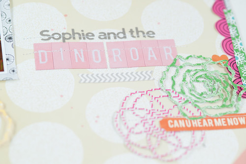
The April kit at Scrapbook Circle is full of bright, happy, and even neon colors! Such a pretty combination, but I have to admit that it's a bit outside my normal palette (I love color, but seem drawn to more muted tones). The happy combination of Amy Tan's new Sketchbook line, Heidi Swapp's neon embellishments, and a bit of Lily Bee and Jillibean soup thrown in for good measure makes for a very playful kit, so I decided to step outside of the confines of my normal scrapping comfort zone and try a few "playful" new things on my design team layouts this month. Some of them worked and some of them didn't, but I learned a lot along the way, and that's always a good thing.
Some of the new things I tried on this particular page:
- Using a busier-than-normal-for-me patterned paper background (I like to do this with more neutral papers, so this kraft-based Amy Tangerine sheet worked well for me- give me a brightly colored background, though, and my brain ties itself in knots!)
- Photos in the top left of the page (I felt like I had been trending bottom right a lot lately and wanted to shake that up)
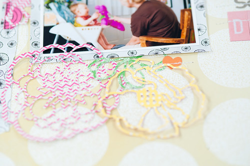
- Clusters of bigger embellishments (I tried this in the form of the large die-cut flowers made with my Silhouette- still not really sure how it turned out, but I kind of dig it)
- More layering on my page border strips, slightly "wackier" cut angles (piecing borders like this is harder than it looks! I don't dislike these, but I think I prefer the cleaner lines of my "straighter" but still hand-cut borders)
- Journaling and title slightly "disconnected" from the photos (I tend to bunch both up either with the photos or along the top or bottom paper strip, but with the vertical borders on this page I decided to try something new)
Sometimes it's good to really "dissect" your scrapbooking style into its basic building blocks and then choose specific elements to change up, especially if you feel like you're in a rut (for more on my take on scrapbooking ruts, be sure to check out the upcoming Everyday Storyteller eBook!). I left some things the same- the photo sizes and matting, for instance, are fairly standard for me, since changing everything at once would have probably really thrown me for a loop!
The photos on this page are of my niece and my Mom playing with one of my old Dino-Roar toys, and I've had them printed up and in my to-scrap box since shortly after I took them last Father's Day. That's my other little tip for the day- I long ago separated the process of printing and scrapping my photos. I now periodically (though not as often as I should, based on the size of my last print order!) go through my unprinted photos in Lightroom and choose a bunch to either print at home or send off to have developed. I try to pick sizes for groups of photos that will easily lend themselves to making layouts in my style (for instance, with three photos I'll print one at 4x3 and the others at 2x3). Those photos then go in my storage box, and I flip through them periodically looking for the ones that will match the supplies I'm working with at the time.
The printing ahead of time step really saves me from choosing photos from my library just because they match my papers. If I've already printed them in advance, that means that I wanted to scrap them eventually, anyway- the fact that they happen to be a match for a particular project is just the icing on the cake! For me it's the key to both scrapping for assignments and keeping my pages meaningful to me.
All of this trying of new things on my pages was not without its consequences! I found that when I tried to go back to my old style it was like shifting gears without a clutch, and I made one page for an assignment that was such an absolute mess that I completely redid it before turning it in. I can't share that one until next week, but I'll be giving you a look at both of them (just keeping it real, here) as soon as I can!
Supplies (click on images for product links):


