Last December I
blogged about the pile of Basic Grey page and layout kits that I gathered up from various local (and some not-so-local) Ross stores. They were being closed out for $3.99 each, and for that price I couldn't help picking up all the different styles that I came across.
Now that it's March, I think it's high time I actually dug into them and started using them, don't you? Though I do feel that I need to preface these posts by saying that I haven't found any more of these kits in Ross stores recently, and I believe that Basic Grey has stopped making them altogether now. If you like the
idea of this type of kit, though, I'm busy researching another option and will hopefully have a complete up-close look and review to share in the next 2-3 weeks. So stay tuned for that!
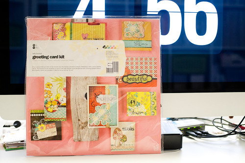
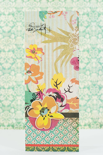
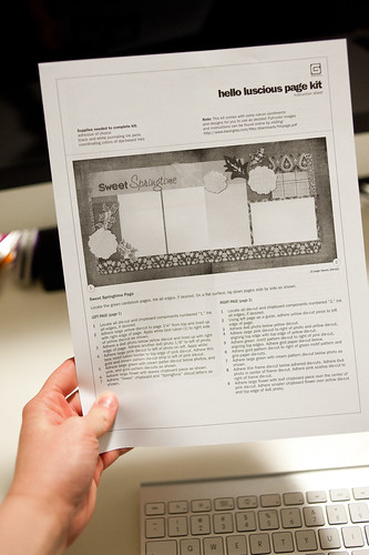
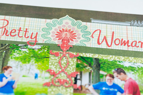
The first kit I pulled out to use is the vibrant
Hello Luscious layout kit.
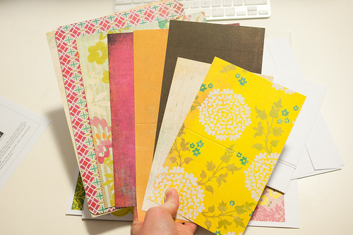
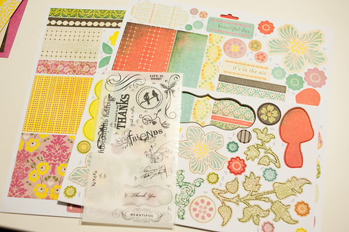
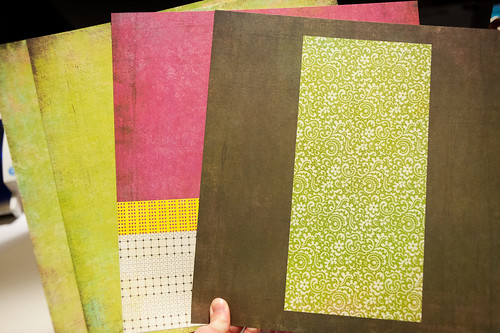
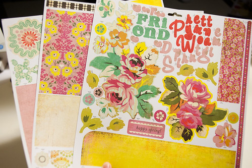
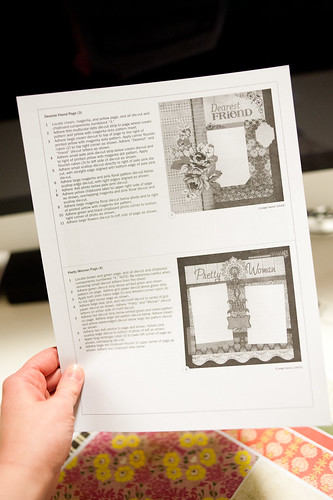
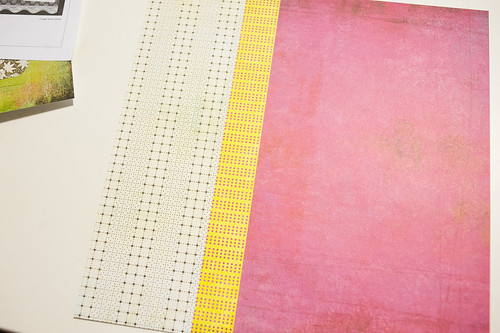
Though the contents of each kit vary somewhat, all the kits contain four (cardstock weight) patterned paper background sheets. You'll notice that some of the sheets have pre-printed elements rather than including separate pieces that you glue into place yourself. This is actually one of the things that I
don't like about these kits since a) I rather enjoy cutting and adhering paper and b) it makes it really hard to do anything outside the box with the kits (there are other factors that also contribute to that that I'll cover later). For that reason, you'll rarely if ever see me stray from the printed directions in these posts.
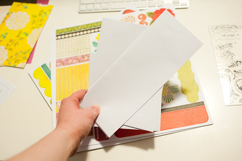
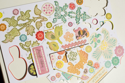
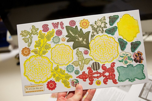
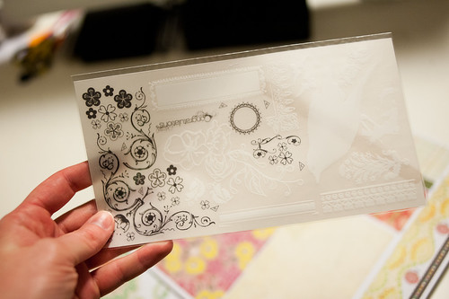
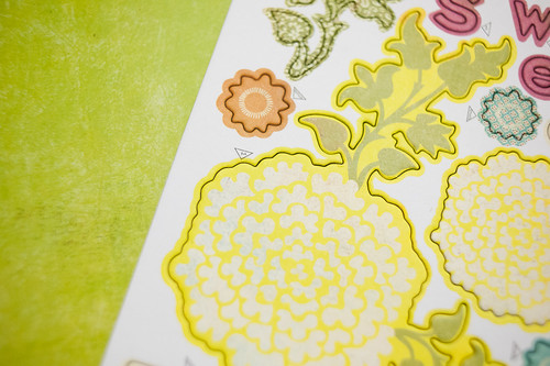
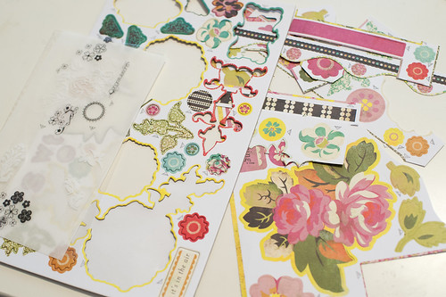
Each kit also comes with a sheet of coordinating printed chipboard, a rub-on sheet, and several sheets of cardstock die cuts.
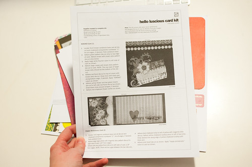
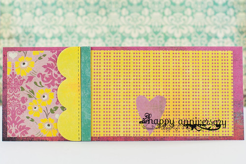
The printed directions and sample images are in black and white, though that's not a huge deal since the kit's cover comes complete with full-color images of each finished layout.
I found that the images on the kit's cover were easier to follow than the printed directions, though I recommend using both.
If you take a closer look at the chipboard elements (and also the rub-ons and die cuts), you'll see that each individual element is labeled with either a number or the word "Bonus." The number indicates which layout (or card in the case of card kits) the piece goes to, and any items labeled "Bonus" are simply extras that you can either add to the kit layouts or save to make extra layouts or cards or use on other projects.
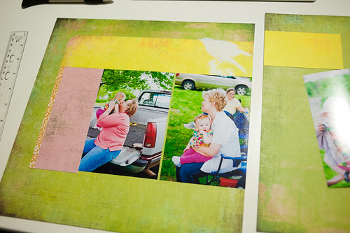
I started with layout 1 on the sheet using pre-printed photos that I had ordered from an online developer (I don't know which one these particular photos came from- sorry). Both the directions and the die cuts are designed such that you often end up building your page around your photos to get the proper placement and alignment for things. This turned out to be a problem in several cases (that I'll detail later), though in the kit's defense it really was a problem with the photos and not the supplies.
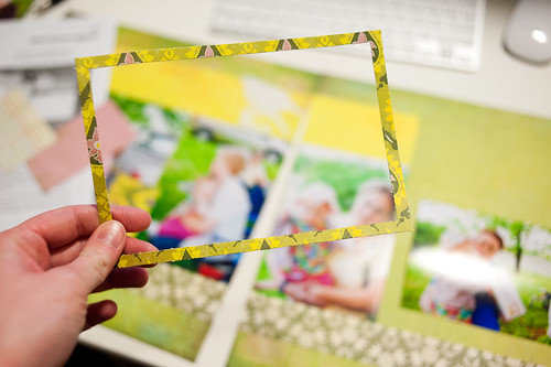
This die cut will illustrate the first issue with my photos. You see, instead of providing a full mat of paper to go behind the layout's horizontal photo, Basic Grey instead included just the outline of a frame. This wouldn't be a big deal if it weren't for the fact that often printed photos come back from the developer at a size that's slightly
smaller than 4x6 (mostly due to loose tolerances and mechanical slop in the developing equipment).
That means that I was left with a tiny gap between the edge of my photo and the edge of the frame. It's not a huge deal, but it still irks a perfectionist like me.
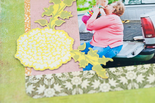
The issue with slightly off-size photos was even worse when it came to lining up the papers. See the height gap between the yellow and pink pieces? That was totally caused by the fact that my photos came back from the developer at a size slightly smaller than 4x6.
Still, overall the layout looks pretty good- luckily the chipboard leaves help cover some of the gap.
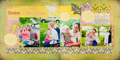
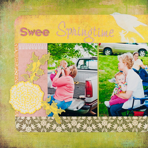
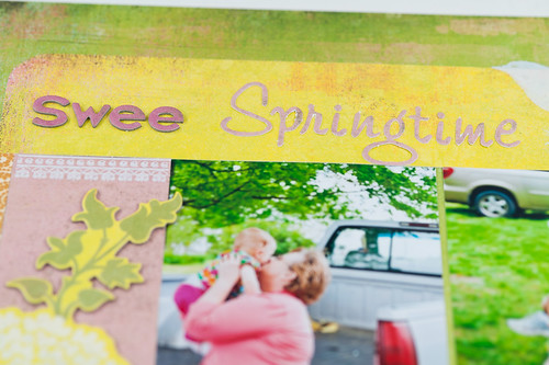
Oh, and notice the lack of a "t" at the end of "Sweet" in my title? Somehow I knocked that one little letter off of my scrapping desk while working and could not for the life of me find it no matter how much I looked around. Hopefully I'll run across it soon and be able to finish this page up!
And hopefully I'll remember which layout it goes with when I do eventually find it!
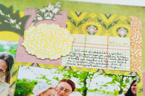
I chose photos for all three of these layouts from a stack of 4x6 prints I'd had made from my photos of
Beth's birthday party last year. I'd originally printed them up thinking I'd add them to divided page protectors beside the regular layouts I've already scrapped about the event, but they work well here, too. I'll probably end up doing a mix of both.
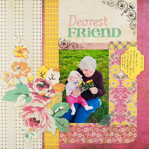
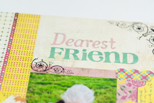
Luckily these photos also at least sort of fit with the theme of the titles. That's another thing about working with a kit like this- if you don't like (or can't use) the pre-existing page titles, there are no extra letter stickers included to make your own, so you'll have to pull from your own stash and hope you have something that matches. Luckily I could use the titles as-is.
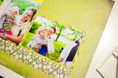
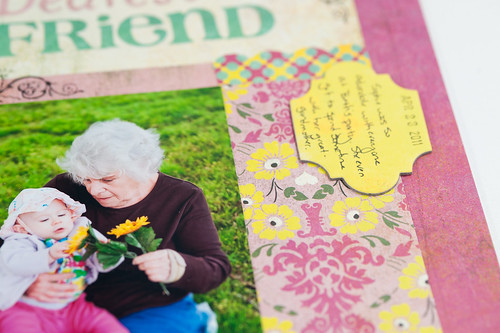
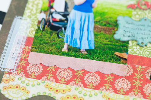
You can see a tiny gap between the bottom of the photo and the bottom strip of paper in the page above- again due to not-quite-4x6 photos. The problem isn't so pronounced here, though.
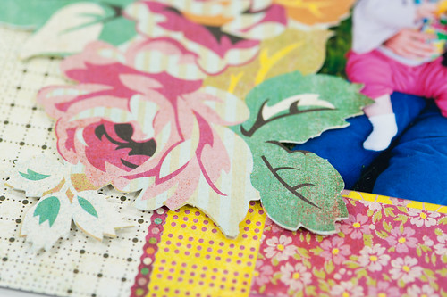
For this page I decided to pop the large floral cardstock die cut up on dimensional adhesive just to add a bit of "oomph" to it. If flowers can have oomph, that is.
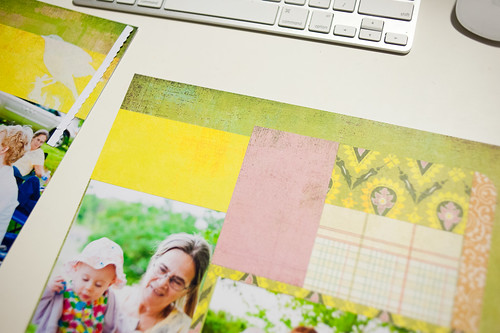
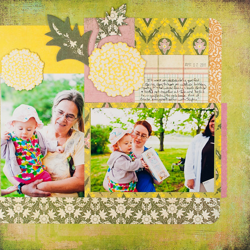
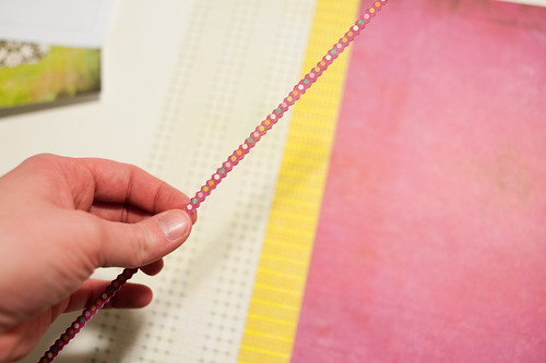
This layout also uses one of the pre-printed backgrounds, and I wanted to show you one of the cool little tricks that Basic Grey uses to make these look not quite so flat.
See this tiny die-cut cardstock strip? It went right between the white and yellow sections to add a little dimension. The photos then stacked up against the border between the pink and yellow pages, so in the end everything was pleasantly un-flat.
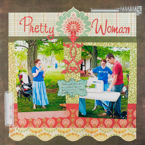
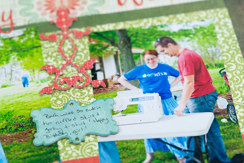
On this last layout I didn't have to struggle with undersized photos at all since the entire background is built up before the photos are applied at slight angles. And how lucky did I get to have a couple of photos of cute miss Beth in her ruffled skirt and geeky t-shirt to use here? They fit the title perfectly!
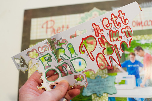
And on the subject of the titles- dude are they a
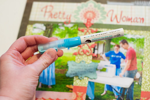
pain to punch out of the carrier sheets! And the letters are delicate, so you have to be really careful about removing them. Luckily I didn't tear any!
I recommend a glue pen like this ballpoint version from Martha Stewart Crafts (I bought mine a Michaels) for the really skinny letters- not even mini Glue Dots are small enough for those!
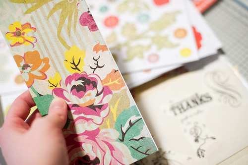
There was a nice little stack of leftovers after I completed the last page. I'm already eyeing that big rose die cut for a card! It'll be fun to play with these pieces on other projects.
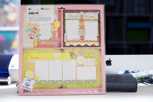
I'm going to continue pulling these kits out and using them throughout the year, and I plan to post each one as I do. I probably won't go into this much depth for all of them, but for the first one I wanted to point out all the little details.
Next up I'll bring you a look at the Hello Luscious card kit- that will be posted in a couple of weeks, and there's plenty more scrappy goodness to come between now and then!