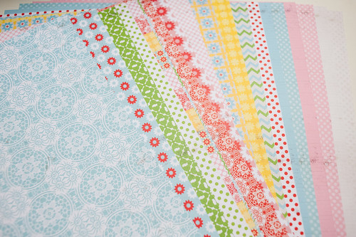
One of my favorite things about Lily Bee paper is how well the lines play together. The patterns are all so complementary to each other, and the colors...well, the colors are the reason I embarked on this little experiment in the first place.
The first thing I did was to take the paper from each collection and flip every other sheet in the package to show the B-side- basically making sure that every pattern in the set had a side up in the stack.
The next thing I did may be a little shocking.
You may want to sit down for this.
Because I can't be held responsible for any injuries incurred due to reading this while standing.
In the next step, I mixed up all the new LilyBee papers into one big stack!
Yes, really!! I completely mixed the lines!
I didn't mix them randomly, though. Instead, I sorted them all in ROYGBIV order (except LilyBee doesn't really have a Indigo/Violet shade in this release, so it's more like ROYGBPinky-Purple).
Don't you just want to roll around in that lovely pile of paper for a while?
I'm keeping a whole set of Lily Bee papers together just like this from now on- love it!
And, yes, there were a few patterns that could only be categorized as multi-colored, so I made a special stack for them and put them at the end of the paper rainbow.
With all the paper fondling out of the way, it was time to get down to my actual assignment- use something from each of the lines on a page. I started by selecting papers that worked best with the photos I wanted to use and ended up with something from three of the four collections represented in my pile (and I made sure to visit the multi-colored stack, as well, to select a paper or two from it).
That fourth collection that I didn't choose paper from? I chose an alpha instead, so it all worked out. :)
And here's the finished page. I actually didn't use all the potential papers that I'd selected, but all the collections are represented here- Buttercup, Double Dutch, Handmade, and Victoria Park- in one form or another.
I had so much fun with the triangle background! I cut the mask (it's actually two border shapes butted up together horizontally) using my Silhouette Cameo and then placed it on the background cardstock before misting. The little filler triangles are actually the "negative" space cutouts left on the carrier sheet after cutting the borders- love those little pops of color!
Don't be afraid!! You, too, can mix Lily Bee lines- it's easy and fun!
Supplies (click on images for product links):


