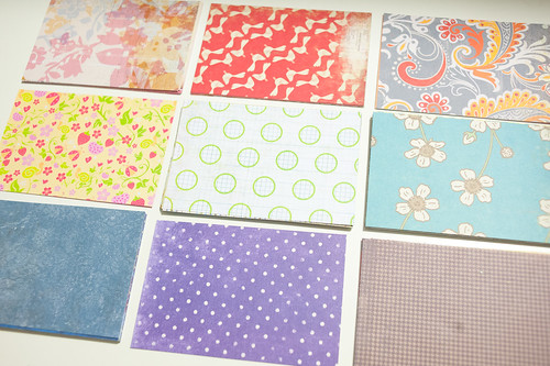
For today's second post with a concentration on using up scraps in Project Life, I'm going to focus on those 4x6 and 3x4 blocks that I mentioned I was cutting yesterday.
Now, if you either a) didn't cut your scraps to those sizes or b) don't do Project Life, that's perfectly, totally, and completely okay! I think you'll find that the little trick I'm about to show you will help you combine all kinds of scraps in all kinds of colors and sizes to use on both traditional layouts and on cards and not just in Project Life.
I'm going to explain it, though, using a Project Life analogy. You see, in its simplest form, Project Life (and, by the way, if you're sitting across the screen yelling at me, "Melissa, what the heck is this Project Life thing you keep going on about?" you'll definitely want to read up on it on Becky Higgins' web site here) is assembled using a "Core Kit," which is a collection of coordinating journaling cards and elements that gives an album a common feel throughout all the pages. Core Kits are great in that they make it very easy to have a well-designed album with a minimum of work, but I found that I got bored using the same papers over and over again each week.
Like, really, really bored.
So I decided this year that I would change things up and use a totally different set of supplies each week, keeping continuity across that week, but not really caring how it meshed with the album as a whole. So far it's working really well for me (not bored yet!!), and for this week's Project Life layout share, my scraps definitely came into play.
The trick to taking all of those scraps and turning them into something a bit more unified is to find a common color palette to draw your layout's colors from. You can do this in any number of ways, but my go-to method is to browse my two favorite sites for color palettes (Photo Card Boutique and the Color Inspiration section of The Sweetest Occasion), and then use that palette as a guide for choosing scraps for my next card, layout, or Project Life spread.
As I was setting out to work on this particular week's layout, this color combination from Photo Card Boutique really caught my eye, so I bookmarked it and got to work.
Using that palette as a guide, I quickly flipped through my scraps and chose papers that roughly matched (not going for exact, here, just close) and came up with the kit below.
As you can see, there's a huge variety here- Making Memories, K&Company, Crate Paper, Basic Grey, My Mind's Eye, and even a favorite bit of Sassafras that I haven't used yet. There's also a pretty good mix of old and not-so-old (though nothing really terribly new here).
With the addition of a few labels, border stickers, Thickers, and a few pieces of basic grid journaling cards from the Becky Higgins line, we've gone from a pile of scraps to a color palette to a coordinated kit, and all the way to this layout that is now part of my Project Life album!
You might notice right off the bat that this week goes way back to February of this year. While I've worked on lots of weeks after it, for some reason I kept skipping over this one. I think that the bright orange wrapper from one of my new favorite snacks (Honey Stinger Orange Blossom chews) kinds of scared me every time I flipped past it, but I think it finally found a home and has blended pretty well with the color scheme.
On the left hand page (above) you'll find a taco salad dinner and stuff blooming in the yard (one of my favorite things to photograph right now).
I used the patterned paper blocks in a variety of ways to create journaling cards throughout the page. Sometimes I topped a plain grid-print card with a strip of patterned paper, and other times I placed a piece of grid journaling card on top of the pattern itself. Both ways work well, and I like mixing them up across a layout.
Washi tape is a good staple to have a around- it brings just the right pop of pattern to smaller spaces.
On the right hand page you'll find my favorite pajama pants (hey, St. Patrick's Day birthday, so I gotta have shamrocks, right?), my favorite Vietnamese restaurant, some work on the rental house, the arrival of the DCWV items that I featured on the blog earlier this year, and some evidence that Darren picked up swimming again for a while.
I used a lot of the same tricks on this page, too. Patterned paper blocks and strips, border stickers, washi tape, and even a brad or two to dress things up a little.
Super easy and fun, right? Using color palettes to unify scraps from a variety of lines and manufacturers is a great way to reduce the scrap pile while increasing the number of layouts in your albums, and it also helps you to get the most value possible out of your scrapbooking purchases.
I'll be back tomorrow with a completely non-Project Life focus (I promise!) as well as a look at one of the cool newer tools from Spellbinders that can help you get the most from your paper scraps.
See you then!
Supplies (click on images for product links):


