Last week and for the next several weeks I'll be sharing the remaining Project Life pages from my 2011 album. I've mentioned a few times before that I'm a bit behind on getting my photos from the end of 2013 and the beginning of 2014 edited and printed, but I'm making good progress on catching those up and will be sharing a couple of tips about how I'm making that happen soon.
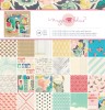
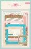
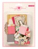
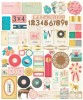
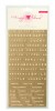
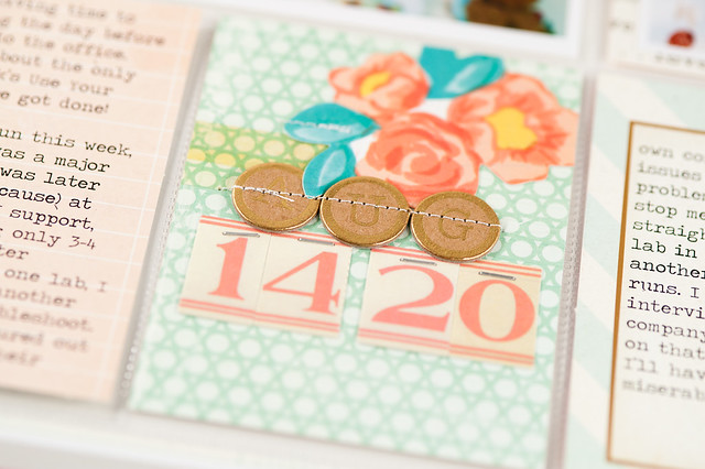
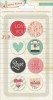
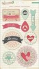
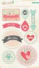
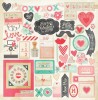
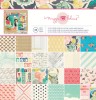
Until then, I do have all of my 2011 photos printed and ready to go, and for this week's layout (covering August 14-20), I decided to use the new Styleboard collection by Maggie Holmes for Crate Paper.
Supplies:
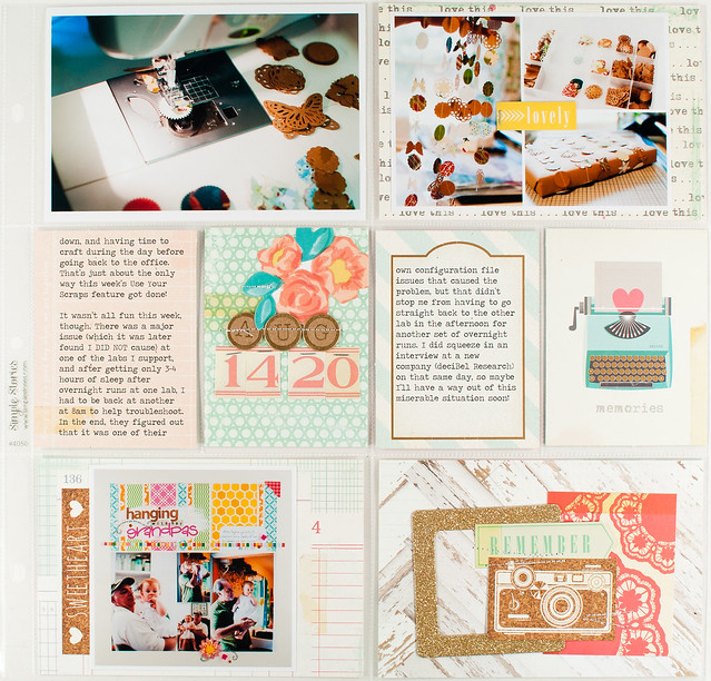
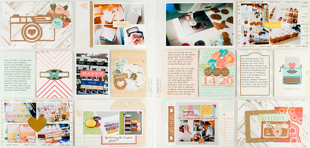
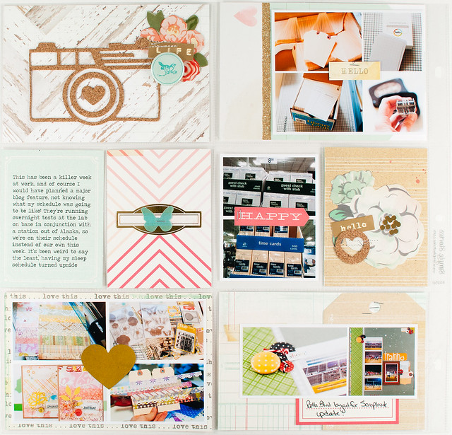
One thing you'll probably notice right away when looking at this layout is that it's a lot more embellished than what I normally make! That's by design, since as I was working on this page I was feeling like doing lots of layering and clustering. I actually really enjoyed that process, though at the end my pages did feel really busy. I think that's partially due to the 12x24 format, though, and the fact that it just has so much space to fill- just one of the reasons I'm excited to try the smaller 6x8 canvas for 2014!
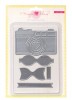
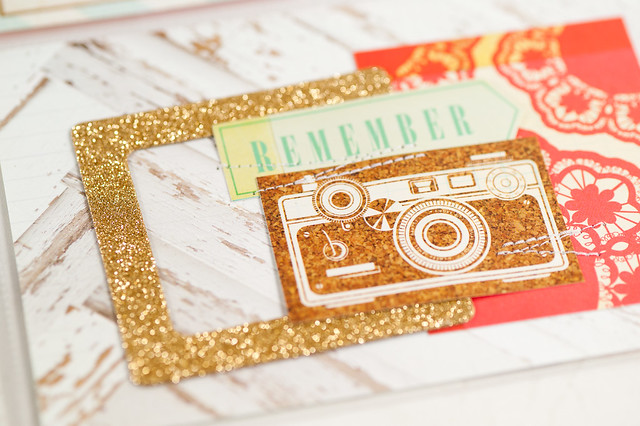
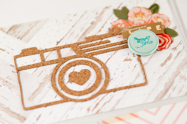
One of my favorite parts of this page is the large camera that I cut using the Styleboard dies and my Sizzix Big Kick. The dies work perfectly with thin cork sheets, and though I've read about a few people having trouble with these, my cuts came out very nicely whether I used cork or paper. The cut on this page does have a slight tear on it, but that happened after it was cut and stuck down. I had originally placed that flair badge a bit higher, and when I removed it, a small section of the cork came off with it- ooops! Since much of Styleboard has a shabby feel to it, though, I decided to leave it as-is.
This layout is an example of how I fill weeks where I don't have many photos- just play with the empty pockets! If you want more ideas for layouts covering timespans where you and your camera just weren't in BFF mode, I also put together a video lesson covering this topic during my time at Two Peas last year. You'll find that project here.
Thank you so much for stopping by today- have a happy Monday!
Project Life 2011 - August 14-20
Sunday, February 23, 2014
Hola, and happy Sunday, geeklings!
I'm a bit wiped after yesterday's IKEA trip- 4.5 hours of driving one way, lots time in the store, and I think than 80% of Ohio decided to shop there on the same day, to boot! We still managed to get everything we were after, but today Mom and I are just a bit tired. :)
The geek goes on, though, as always, and, in addition to today's roundup, you'll find a 49 page preview of the upcoming Han Solo standalone novel, Honor Among Thieves, over at Random House (click on the "Look Inside" button below the image of the book cover). It's been quite a while since I had a new Star Wars book to read, so I'm looking forward to this novel's March 4 release.
From the top left:
Tonight's video is a long-ish one, but absolutely amazing to watch as Adam Savage (of Mythbusters fame) builds a replica of Han Solo's blaster.
MTFBWY!
I'm a bit wiped after yesterday's IKEA trip- 4.5 hours of driving one way, lots time in the store, and I think than 80% of Ohio decided to shop there on the same day, to boot! We still managed to get everything we were after, but today Mom and I are just a bit tired. :)
The geek goes on, though, as always, and, in addition to today's roundup, you'll find a 49 page preview of the upcoming Han Solo standalone novel, Honor Among Thieves, over at Random House (click on the "Look Inside" button below the image of the book cover). It's been quite a while since I had a new Star Wars book to read, so I'm looking forward to this novel's March 4 release.
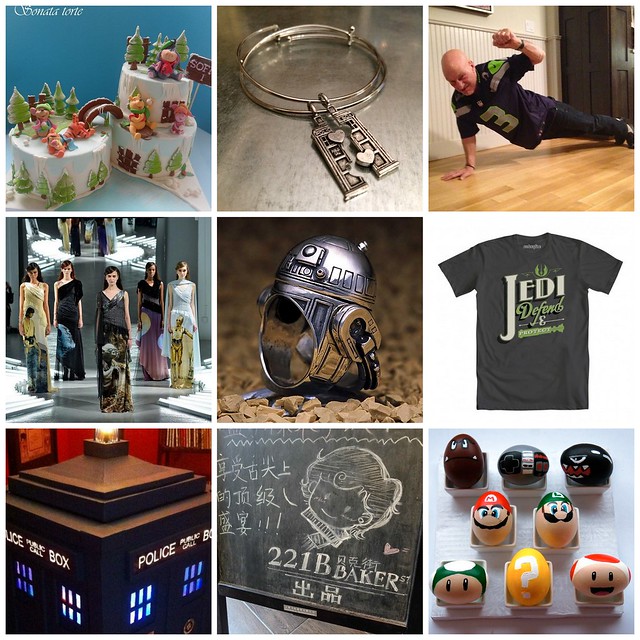
From the top left:
- This Winnie The Pooh winter wonderland cake is probably more adorable than geeky, but I have Disney on the brain right now and just had to include it!
- Split a TARDIS with your bestie with this Doctor Who themed friendship bracelet set.
- Yes, that is Patrick Stewart, doing a one-armed push-up in celebration of the Seahawks' Super Bowl victory. Perhaps even more epic is the Twitter exchange between he and Will Wheaton that followed!
- I don't normally fall in love with much of anything that comes out of New York Fashion Week, but these Star Wars dresses by Rodarte? I'm going to need them all! Unfortuately they'll only be available for photo shoots and promos in the fall, so the most I can hope for are knockoffs at H&M...
- This cute + chunky R2-D2 ring is just one of many Star Wars inspired pieces by JAP.
- Typography meets the GFFA in these awesome t-shirts by Steve Thomas.
- This 1/3 scale TARDIS jukebox was made out of upcycled cardboard boxes and comes complete with a spinning disco ball and club lighting on the interior. Click through the link for a video!
- Shanghai now boasts a Sherlock themed cafe, appropriately named 221B.
- Since Valentine's Day has officially passed, I think I'm safe to start posting the Easter geekiness now, including projects like these Super Mario themed eggs.
Tonight's video is a long-ish one, but absolutely amazing to watch as Adam Savage (of Mythbusters fame) builds a replica of Han Solo's blaster.
MTFBWY!
Saturday, February 22, 2014
I actually almost never have Valentine's Day photos, unless you count the one of me holding a copy of Skyfall Blu-Ray that was last year's celebration, or maybe a photo of this year's grilled lobster (hey, at least it's red!), so any time I'm assigned a Valentine's themed layout, I more than slightly freak out (as explained here). Luckily Crate Paper kept things open when they handed out assignments using this year's Valentine's collection, Love Notes, and asked me to simply scrapbook on the topic "Love This."
Supplies:
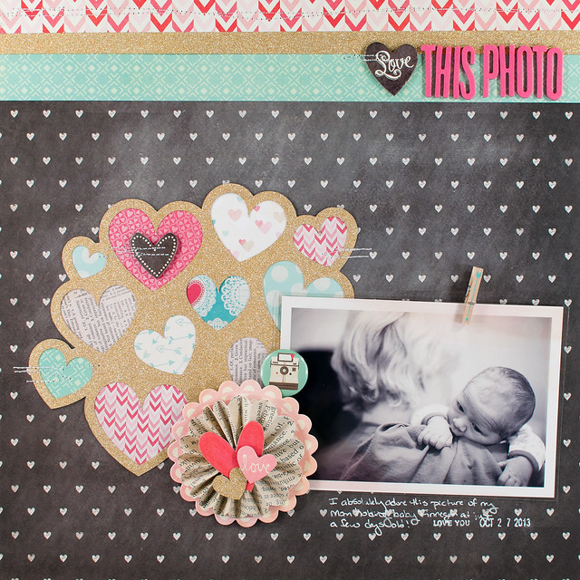
I thought through lots of things that I could have scrapped about- travel, home, and David Tennant's hair for starters- but settled instead on family, specifically a photo I took of my Mom and my little nephew Finnegan when he was just a week or so old. It was one of those photos that I originally thought was "meh" at best...until I changed it to black and white. Suddenly it took on a whole new character, and I loved it. I'm definitely going to have to try black and white more often!
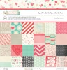
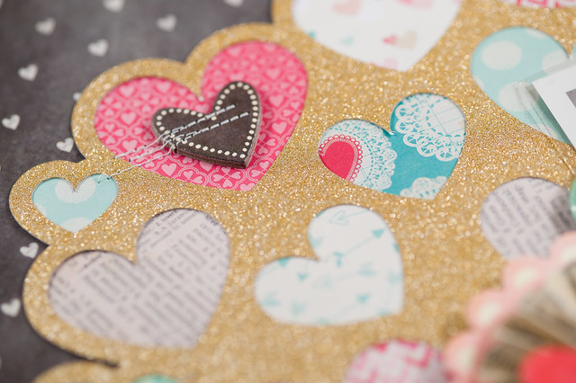
The design of the page was almost entirely inspired by this heart cluster cut file from the Silhouette Store. I cut it out of American Crafts' gold POW! glitter paper, then filled in each of the hearts with a little bit of pattern cut from the collection's 6x6 pad. By using them in tiny amounts, I was able to get lots of patterns from the collection onto a single layout without them being overwhelming, and I anchored it all on a neutral background.
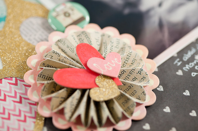
To blend the gold with the design, I added it in two more places on the layout. The gold heart on accordion flower above was actually one of the pieces left over from cutting the larger cluster, and the strip of gold across the top of the page creates a very loose visual triangle (extremely scalene, but a triangle nonetheless), so there's not just one big blob of gold on one section of the page. Repetition, baby!
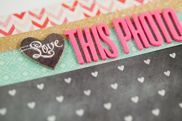
A couple of quick things to point out about the title above. First, the Thickers- I love this font, and I also love how Crate put two different colors of it (pink and cream) in the same package. I'm hoping they do more of that in the future. Second, I subbed in a chipboard piece with the word "Love" on it as part of my title. I seriously love Crate's 12x12 chipboard sheets- nobody does it like them!- and I'm super bummed that the new collections starting with CHA Winter 2014 come with thinner chipboard "packs" and not the nice, heavy sheets. I will certainly miss them, and I hope they decide to bring them back!
Supplies:
I thought through lots of things that I could have scrapped about- travel, home, and David Tennant's hair for starters- but settled instead on family, specifically a photo I took of my Mom and my little nephew Finnegan when he was just a week or so old. It was one of those photos that I originally thought was "meh" at best...until I changed it to black and white. Suddenly it took on a whole new character, and I loved it. I'm definitely going to have to try black and white more often!
The design of the page was almost entirely inspired by this heart cluster cut file from the Silhouette Store. I cut it out of American Crafts' gold POW! glitter paper, then filled in each of the hearts with a little bit of pattern cut from the collection's 6x6 pad. By using them in tiny amounts, I was able to get lots of patterns from the collection onto a single layout without them being overwhelming, and I anchored it all on a neutral background.
To blend the gold with the design, I added it in two more places on the layout. The gold heart on accordion flower above was actually one of the pieces left over from cutting the larger cluster, and the strip of gold across the top of the page creates a very loose visual triangle (extremely scalene, but a triangle nonetheless), so there's not just one big blob of gold on one section of the page. Repetition, baby!
A couple of quick things to point out about the title above. First, the Thickers- I love this font, and I also love how Crate put two different colors of it (pink and cream) in the same package. I'm hoping they do more of that in the future. Second, I subbed in a chipboard piece with the word "Love" on it as part of my title. I seriously love Crate's 12x12 chipboard sheets- nobody does it like them!- and I'm super bummed that the new collections starting with CHA Winter 2014 come with thinner chipboard "packs" and not the nice, heavy sheets. I will certainly miss them, and I hope they decide to bring them back!