
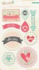
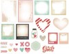
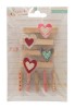
Supplies:
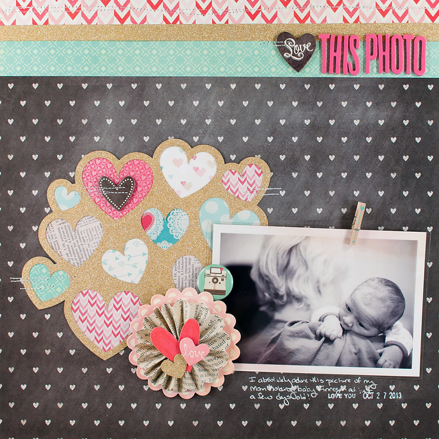
I thought through lots of things that I could have scrapped about- travel, home, and David Tennant's hair for starters- but settled instead on family, specifically a photo I took of my Mom and my little nephew Finnegan when he was just a week or so old. It was one of those photos that I originally thought was "meh" at best...until I changed it to black and white. Suddenly it took on a whole new character, and I loved it. I'm definitely going to have to try black and white more often!
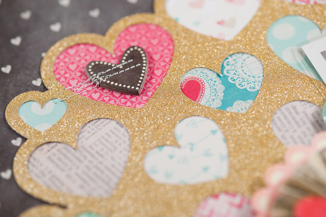
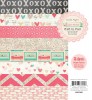
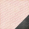
The design of the page was almost entirely inspired by this heart cluster cut file from the Silhouette Store. I cut it out of American Crafts' gold POW! glitter paper, then filled in each of the hearts with a little bit of pattern cut from the collection's 6x6 pad. By using them in tiny amounts, I was able to get lots of patterns from the collection onto a single layout without them being overwhelming, and I anchored it all on a neutral background.
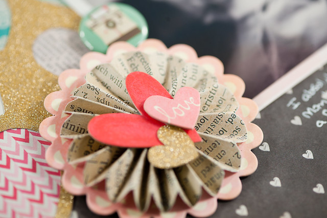
To blend the gold with the design, I added it in two more places on the layout. The gold heart on accordion flower above was actually one of the pieces left over from cutting the larger cluster, and the strip of gold across the top of the page creates a very loose visual triangle (extremely scalene, but a triangle nonetheless), so there's not just one big blob of gold on one section of the page. Repetition, baby!
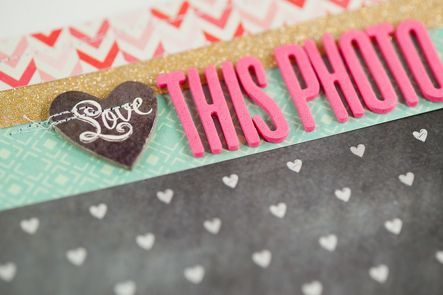
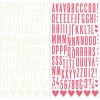
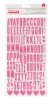
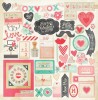
A couple of quick things to point out about the title above. First, the Thickers- I love this font, and I also love how Crate put two different colors of it (pink and cream) in the same package. I'm hoping they do more of that in the future. Second, I subbed in a chipboard piece with the word "Love" on it as part of my title. I seriously love Crate's 12x12 chipboard sheets- nobody does it like them!- and I'm super bummed that the new collections starting with CHA Winter 2014 come with thinner chipboard "packs" and not the nice, heavy sheets. I will certainly miss them, and I hope they decide to bring them back!