simple scrapper layout | slightly obsessed
Thursday, September 22, 2011
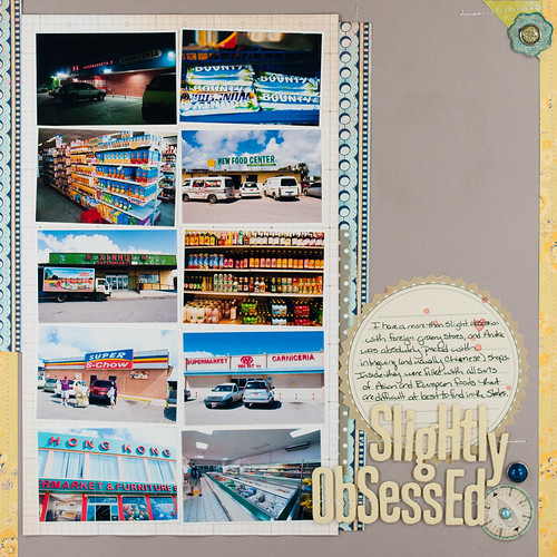
I think it's high time that I posted my second Simple Scrapper layout for the month! I used one of the layered templates from the September Collection as a blueprint for this page, breaking up the large photo block into a bunch of small photos (because working with big photos makes me want to pull my hair out...).
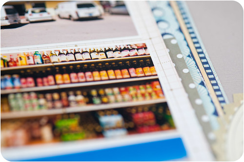
The subject matter is something that I like to think is pretty unique to me- my obsession with foreign grocery stores. I've blogged about exploring them in Nassau and Aruba, so why not scrap about it, right?
I must have blogged about it more than I realized when posting my Aruba photos, because after one particular post I got an actual phone call from a friend of mine in Boston asking me why in the world I took so many pictures of grocery stores...I think he thinks I'm a weirdo for it, but, hey, whatever floats your boat, right? I'm nothing if not unapologetically myself. :)
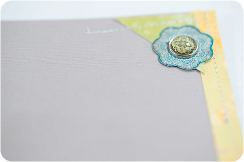
Another one of my current obsessions also popped up on this layout- decorative brads. I love, love, love these brads from My Mind's Eye's Stella and Rose collection (and now the ones from all the CHA Summer releases including Lost and Found 2) and find myself using them on almost every layout. They're such easy ways to add little pops of color and interest.
And every once in a while you find a brad with just the right theme, like this compass brad. So perfect for a travel layout!

