I'm back today with the final installment of this round of Back to the Future, a blog segment where a hot new scrapbooking collection is combined with supplies from the archives of gone-but-not-forgotten favorites. This week's adventure has taken us from using the clean, modern, graphic Snippets collection by Studio Calico to the soft, vintage style of Sweetly Smitten by Sassafras. The tones of these two lines are definitely on different ends of the spectrum, so how well will they work together? Let's find out!
Supplies:
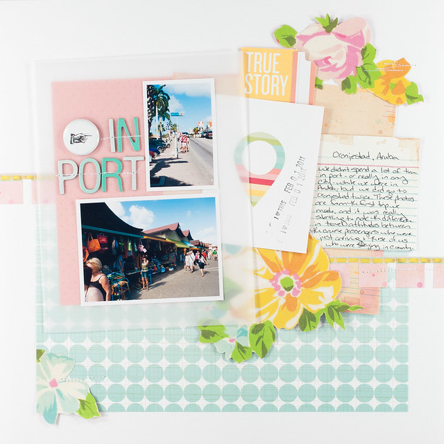
It's not completely obvious just from looking at Snippets and Sweetly Smitten that they work together, but their common color palette allows them to pair up, especially with the right layout subject to tie them together. To me the combination of clean, vintage, and bright brought to mind our trip to Aruba a couple of years ago, and if you've ever been to the Caribbean you'll know what I mean. There's something old-world-meets-modern about the whole place, with a mix of salt-worn buildings next to sparkling new resorts and everything painted in bright colors or covered in tropical flowers.
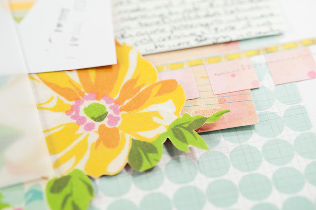
Like yesterday's page, the style of this layout is outside my norm- bigger pieces of paper and a bigger photo block- and like yesterday it's because I based the page on a sketch by Shimelle Laine. Her sketch is designed to show off a paper you don't want to hide, but in my case I just wanted to make sure I used a lot of that ombre aqua dot paper. I switched things around from the original sketch to make them work for me by rotating the photo block to vertical, splitting the line that runs across the top third of the page to run through both the top and bottom thirds, and moving the journaling up a bit.
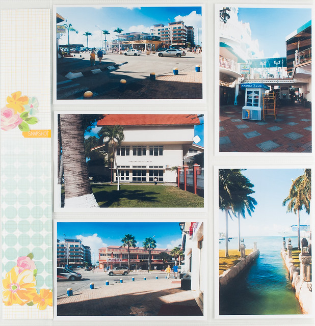
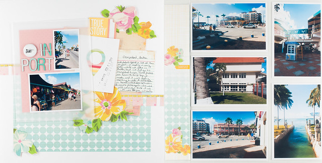
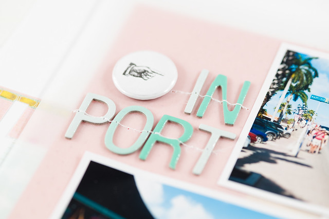
I also added a second page to this layout to house a few last random photos I had from the one day that we spent some time wandering around Oranjestad while we were in Aruba. It's my favorite method of making two-page layouts- one side is creative and pretty, and the other side is a divided page protector that I've just thrown photos and a bit of embellishment into.
After I finished this page, I realized that I've already scrapped a couple of the photos before, and oddly enough on that layout (that I made almost a year ago) I chose to use bigger page elements, too, in the form of some lovely journaling cards from Lily Bee. It honestly doesn't bother me to have photos scrapped twice, and this page tells a different part of the story, anyway, so into the Aruba album it goes!
I filmed a video of this layout going together, too, and it includes both the regular and pocket page side of things.
That wraps things up for this particular installment of Back to the Future! If you have any requests for lines old or new that you'd like to see featured, please leave me a comment. If I have it in my stash, I'll do my best to work with it as this feature continues throughout 2013!

