
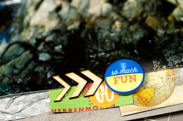
Travel layout #1 shows that not all travel pages are about vacations! I snapped these photos using my iPhone right before heading off on a 3 mile run down a lovely trail near my hotel when I was on a business trip last fall. I have to find some way to work out when I'm away from home for work all week, or I get really grouchy really fast!
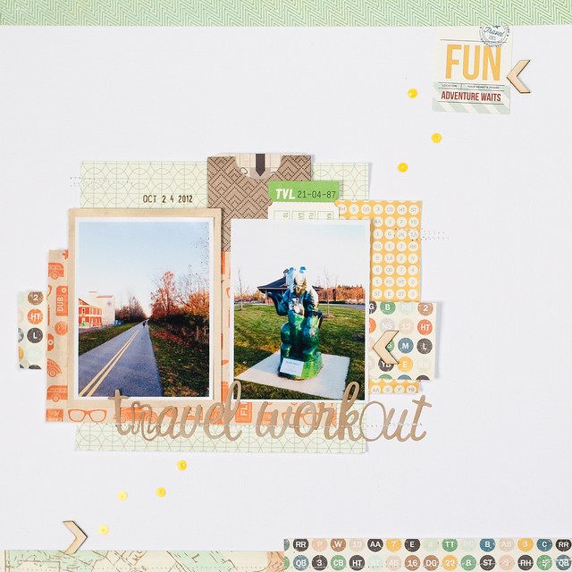
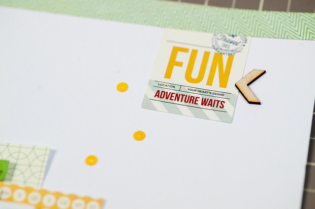
Almost everything on this page is from the August Pocket Life kit, with the exception of the letter stickers and the Basic Grey pocket that I tucked my journaling into behind the photos. The alphas actually started life in a shade of baby blue, but I recolored them with alcohol markers to change them to a nice shade of brown instead. Totally love how the alcohol markers can be used to recolor letter stickers so smoothly!
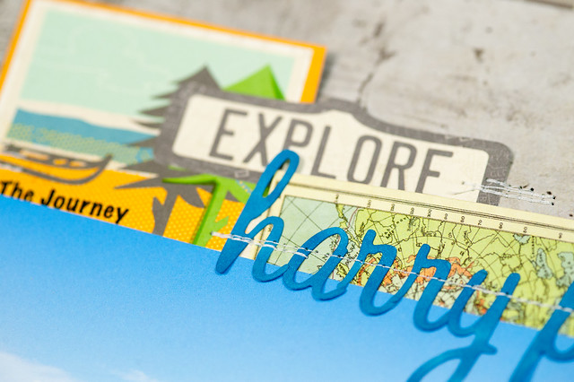
Travel layout #2 is definitely all about vacation, though I could definitely see myself living in Aruba- it's still one of our favorite trips ever! During our eight days on the island, Darren and I got in the habit of giving landmarks our own names, mostly thanks to the serious lack of signage anywhere around the place. We dubbed this stone formation, complete with epic crashing waves, the "Harry Potter Rock" because it reminded us of the scene at the 1:11 mark in the video below from The Half-Blood Prince.
Yes, we are both total geeks.
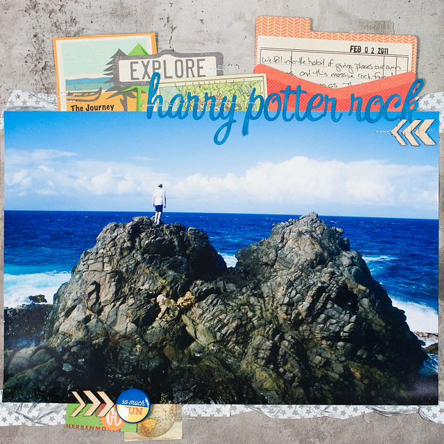
This page was something just a bit different for me again (the celebration layout I shared last Friday was a little out of my norm, too) since it uses a massive photo that takes up almost a full 12" x 8" of space on the page. I've been wanting to try a page like this for a while, though, and the concrete-looking patterned paper from Simple Stories was such a great backdrop for this photo that I had to try it!
All of the embellishment is contained to either the top or bottom of the page, and I mostly layered in some cut-outs from a sheet of paper from October Afternoon's Travel Girl colletion, tucking them under the top or bottom edge of the photo. I used another of the Basic Grey envelopes here to add my journaling, and once again I colored the alphabet stickers with Chromatix markers to make them just a slightly darker shade of blue.
I have lots and lots of layouts in the queue to share with you over the next several weeks as some design team and guest design spots start to go live, and I'm happy to have more scrappiness in store for the blog in the coming days!