All three of my projects are up on their blog today, and I'll also share a bit about two of them today here, just because I like my projects to come home to live on my own blog. :)
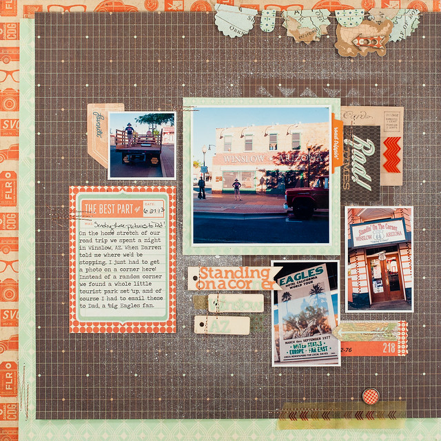
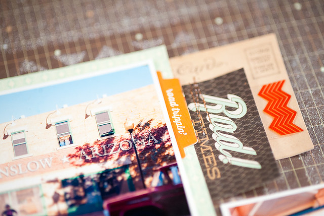
First up is a layout using mostly Carte Postale, with a little bit of Hipster and Capture thrown in for good measure.
Supplies:
The photos were taken on the way home from our summer road trip when we stopped for an overnight in Winslow, AZ- the very same town from the Eagles' song "Take It Easy." My Dad is a huge Eagles fan, so I got an absolute kick out of taking a photo "On the Corner" and then emailing him a copy from the road.
I'm feeling a square/mixed-up photo size kick coming on, especially after the fun I had putting this page together. I've been a little bored with just blocking my photos together lately, so the messy "grid" design was a nice change of pace for me. It's also very similar to the structure I use when I'm designing two-page layouts. I don't really plan my pages as I print photos- I just choose the main photo and make sure it's one of the largest, then print supporting photos in smaller sizes and different orientations. Variety is the key for me- as long as I have a good mix to work with I enjoy the puzzle-like aspect of moving photos around until I'm happy with the placement. Then it's just a matter of filling in the empty spots in the imaginary grid and layering/tucking a few items under the pictures until I like the balance.
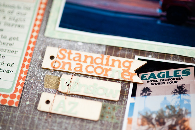
The mint green letter stickers look a bit washed-out in these photos, but in real life they are totally readable. I went back and forth over whether I wanted to use the larger letter stickers from Carte Postale or these smaller ones from Capture, and in the end I decided to use the smaller stickers and pop them up on wood veneer flags from Carte Postale.
My second project to share today is the prep work for Ali Edwards' upcoming 2013 run of Week in the Life on September 9-15. I've completely finished this project twice, and the other two times I've participated I got as far as taking all of the photos and writing things down. While those two things are half the battle I really want a finished album this year, and I'm hoping that having this work done ahead of time will help out with that.
Supplies:
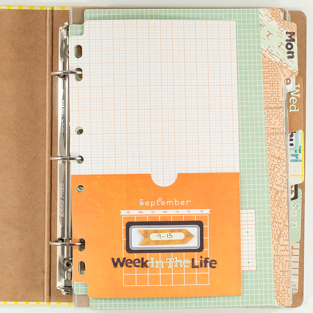
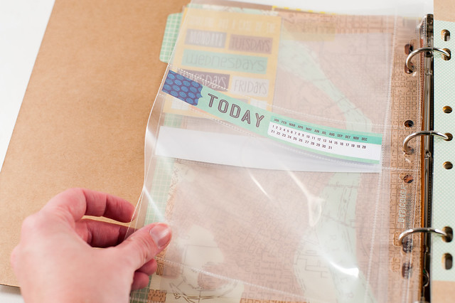
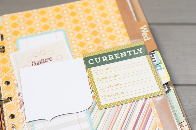
I started with the Ledger Capture album, adding a September calendar pocket to the front to hold any ephemera or other goodies from the week.
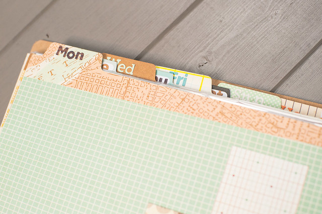
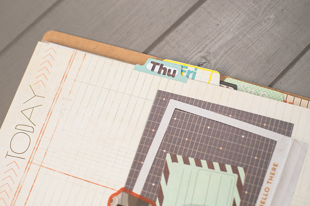
Basic Grey's Capture albums have 5 tabbed pages, and I added in three more by taking some of the journaling pages included in the album and folding tab stickers (also from Capture) over the edges. That gives me a total of 8 tabs to work with- one for each day of the week and a final one for photos of our house since I like to document our living spaces during this time, too.
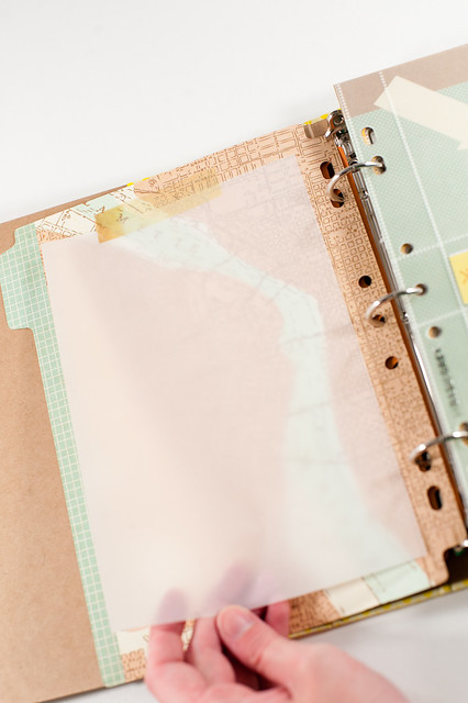
Each tabbed divider has spaces for photos and journaling behind it, and since journaling for Week in the Life can be in-depth and lengthy, I left one entire side of each tab open for just the words. The patterns on the tabs are lovely, but a bit too bold to write directly over, so I'll be printing out my journaling on vellum and then using a piece of vellum tape from the Capture collection to attach it to the tabbed sheet. The words will be a bit easier to read, and the pattern will also still be visible- win-win!
I also added in two divided page protectors behind each day's tab to hold photos, and I've pre-filled a few spots with items cut from various Snippets pads. My thinking is that at the end of each day I'll be able to pull photos from my camera and choose the ones to print based on the open slots available. Keeping it easy it going to be key, I think!
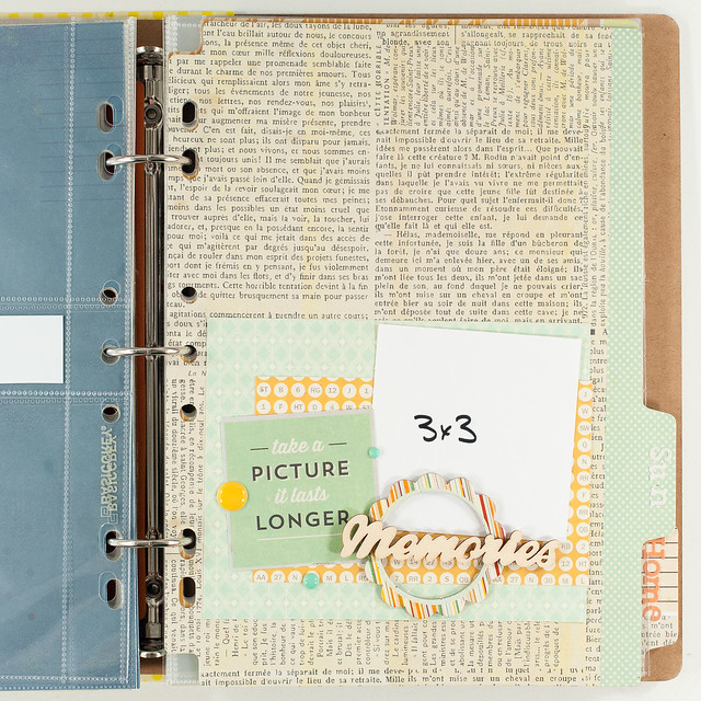
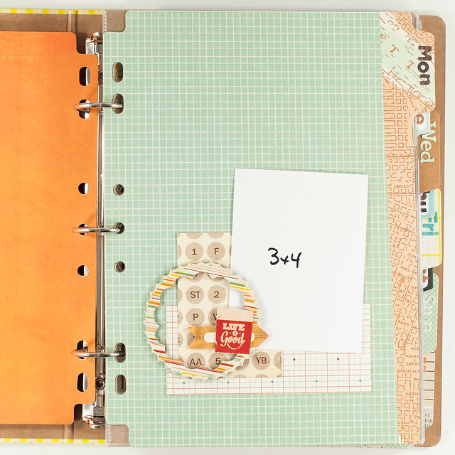
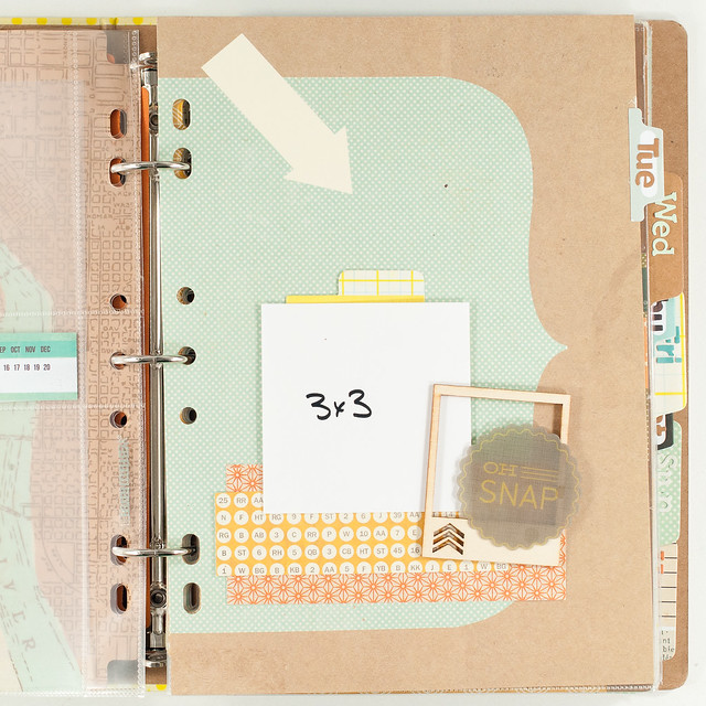
The front of each tabbed divider is the most "decorated" part of the album. I'm trying to keep the rest super simple so I have a chance of actually completing it, but for these seven pages I've pre-scrapped a mini-layout based around a certain size of photo. These sizes are among my go-tos for printing for any type of layout, so it shouldn't be a problem to find a picture each day that fits the size I'll need. And, since these are pre-scrapped, the creative part is already done and I can just slip the photos in. Again, keeping it easy!
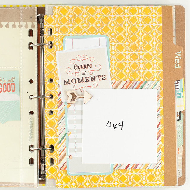
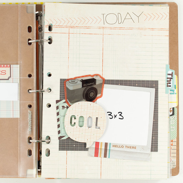
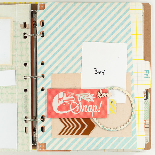

I've filed the album away along with a small selection of embellishments from Captures so everything is ready when September 9th rolls around, and I'll be sharing my finished pages toward the end of September...I hope! :)
Thanks so much to Basic Grey for the opportunity to work with such great products! And I still have one more layout to share- Project Life, of course!- that'll be here on the blog next week.
Happy Tuesday, everyone!

