Some of the best episodes of my favorite television shows start out by showing you the ending (or close to the ending) at the very start. It creates a sense of suspense and keeps viewers asking the question, "how did they get to that point?" It also helps to give context to the "earlier" events as they unfold over the rest of the episode.
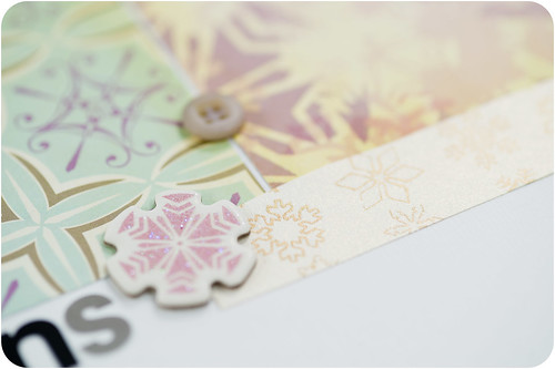
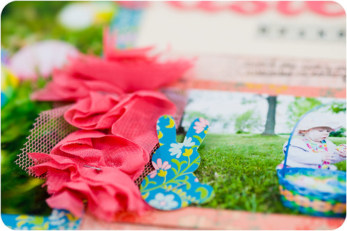
I think that this same tactic can be applied to telling the story of my new scrapbooking style, so today I'm going to show (and tell) you exactly what it is that I've arrived at and love so much, and then subsequent posts will fill in the preceding events. I'll show you peeks and snippets of scrapbook pages to illustrate different items, but, just as those episodes I mentioned earlier wait until the very end to show the final resolution, the full reveal of those pages will have to wait for another post on another day.
With me? I hope so! (Though there are lots and lots of days when I'm not sure that I'm with me…but that's another series of posts entirely!)
I realize that I've been talking about a scrapbooking "style" as if it's something I could name. You know the standard ones- simple, shabby chic, graphic, grungy, etc. I think that we've all seen them used so many times that they've become overloaded and more than a little meaningless, and, besides, who actually scraps in one of these styles all the time? So, instead of focusing on giving it a name, I'm going to focus on specific elements- specific details of what I like and don't like to have on my pages. This isn't a complete list by any means, but it does hit the high points. Remember that styles of any kind be they fashion, home decor, or scrapbooking, are constantly evolving and changing. The same goes for personal styles, as well.
First up, my list of "likes"...
I like using one or two photos, usually 4x3 or 2x3 in size, though 3x3, 3x5, and 4x6 do get used a bit. Luckily, these sizes are all really easy to either order or to print from my home printer (on of those little 4x6 models) one or two at a time as I need them for a layout. I like just one or two smaller photos because it gives me more space to play with design on the page, plus I just dig white space in general.
A quick side note- I do often find myself with more than one or two photos from a particular event that I want to include in my albums. I have a whole other system for these that I will share in a later post!
I like using neutral backgrounds (white, cream, kraft, gray, black), though I'm not opposed to breaking out a sheet of colored cardstock or even a full sheet of patterned paper if it's what will work best for the photo.
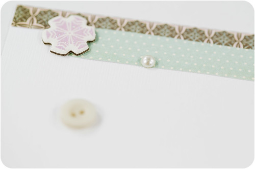
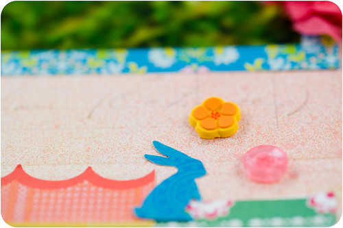
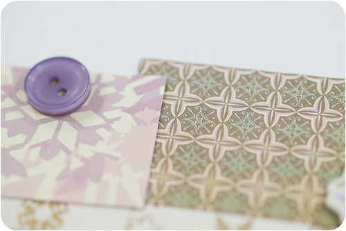
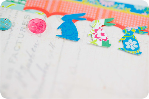
I like small clusters of basic embellishments- buttons, brads, and maybe a flower or two. The "scatter" effect with these types of embellishments is also becoming a favorite technique.
Patterned paper is also one of my favorite embellishments, and I love to use small chunks (generally smaller than my photo) or strips of it either near the photo or along one or opposing sides of the page. I also use tiny bits of ribbon in the same way.
I like using small shapes (think all of those cute 1" Martha Stewart punches) punched from coordinating papers in my embellishment clusters.
I love color mists (especially opaque ones like Studio Calico's Mister Huey) used in small concentrations around the page or with the "ink splatter" effect.
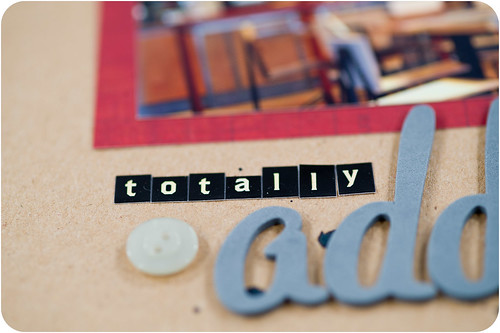
I like my titles to not take up too much space- generally I'll spell out one word with Thickers, and if it's a multi-word title use tiny alphabet stickers to fill in the rest.
I like snark. Whether it's in the title or the journaling, you're likely to find some snarkiness on all of my pages now- it just fits my personality!
I like brief journaling on my layouts. I do have a space for longer journaling to live and will talk about that more in a later post.
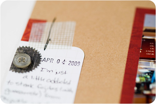
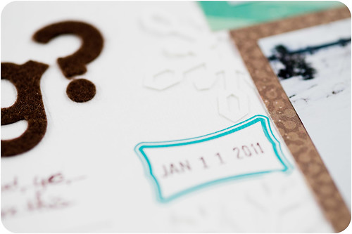
My cheap-o date stamp
I like messy stitching on my pages. Gone are the days of pulling top threads through and tying off my stitching in neat little knots on the backs of my layouts. Now I just backstitch a bit, cut the thread fairly close to the page, and move on. I actually like the look of those little bitty ends on top of my page!
I don't like extremely dimensional pages, so flat embellishments are best for me.
I don't like big blocks of things like photo collages or huge chunks of patterned paper that can only be embellished at the corners where they meet or somewhere in the middle (where it always feels "floating" to me). I think that when I look at a page that I've put together like that and it's already filled with so much pattern and color that my brain screams "enough!!" and refuses to come up with ways to add further embellishment. It just simply shuts down. It needs white space in order to function.
If you were to look around my house, you'd totally think that everything I just described about what I like (and don't like) on my layouts makes sense. My walls are all painted a soothing neutral (Sandstone Cove by Behr), and I bring in color by adding small accents- a vase here, a throw pillow there, and maybe a pretty quilt (or two, or three) on the beds. Photos and artwork are hung in groupings on the walls, but there's always plenty of neutral space surrounding them rather than having the walls completely covered. My scrapbooking style isn't something that I just arbitrarily pulled out of thin air one morning on a whim. It's a reflection of me- how I think, how I function, and how I live my life.
For those who are reading this looking for some insight into finding their own scrapping style, I have an assignment for you. As you go about the rest of your week and your weekend, pay attention to the things that you see around you that you like and don't like. Interesting product displays at the store, colors and patterns in clothing, arrangements and groupings of objects in your home- take a careful look at all of them and make notes (yes, I mean write it down or type it out) about what you do or don't care for. Take some time to sit down with your scrapbook albums (both older and current) and do the same for your pages. Don't worry about looking at pages as a whole, but instead focus on particular elements that you either love or that you want to avoid doing ever again. When you're done, print that list out (or tear it out of your notebook) and put it near your scrapping area where you can easily access it. Use it as a reminder when you're making your pages of what you do and don't like to do.
Next week I'll be back with a post on how I found a way to incorporate ideas from the scrapbookers who most inspire me without directly scraplifting them. It's been one of the most freeing parts of this whole process!

