But then one day they see something that sparks an interest- they discover a new twist on a way of scrapbooking they'd never been interested in before, and everything changes. Suddenly another scrapper's project has made the previously unthinkable a reality, and before they know it they're off on an adventure.
I was that scrapper once- the one who thought I needed to only scrap multi-photo (though I didn't care much if they were one- or two-page) layouts with photos cropped to all kinds of odd little sizes to make them fit. And then one day I came across Jennifer Johner's pages, and it was like a breath of fresh air. Just one or two photos (occasionally more, but not often), lots of white space, and plenty of room to play.
I was hooked. I was in love. And I immediately started scraplifting.
Eventually I got tired of just scraplifting and wanted something of this style for my own. By this time I had also discovered the blogs of two other scrapbookers who shared similar (though definitely unique) styles, so I sat down to do a serious study of them. I wrote out (okay, so I typed it out) out a list of very specific things that appealed to me about each scrappers' layouts- everything from photo sizes to element placement- so that I would have a reference list for when I was stuck and needed a little kick-start to finish up a layout. I made something that I could reference for style ideas instead of just scraplifting whole pages.
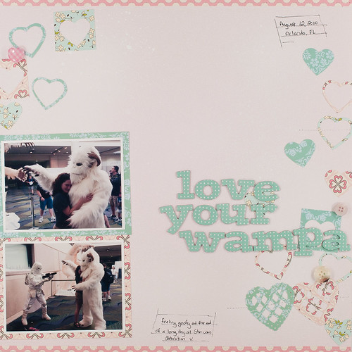
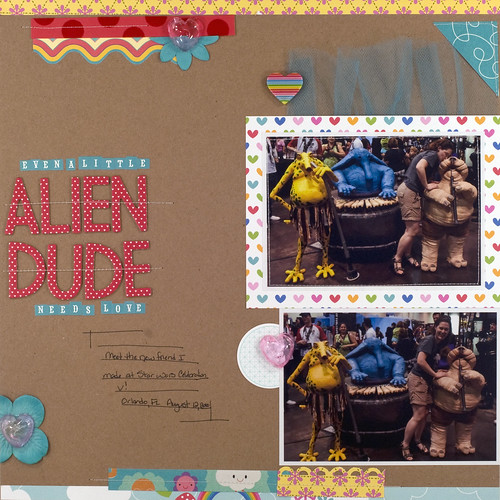
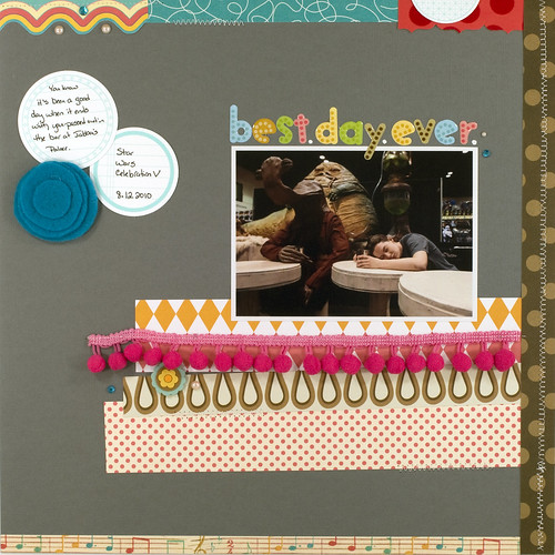
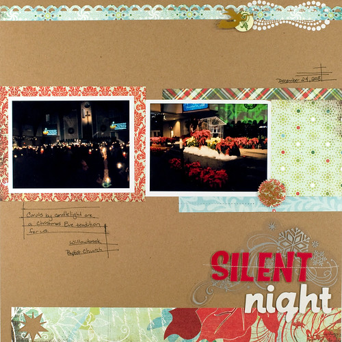
This post is a glimpse of what I learned in that study (sprinkled throughout with more pages that I scraplifted from Jennifer's work). Please keep in mind that the items I'm going to share here pertain to my personal style of scrapbooking. Yours is most likely completely different from mine, and your list of scrapbookers whom you find inspirational is probably quite different, as well. My goal here isn't to tell you how you should be scrapping your pages- instead, I want to tell you how I discovered how I like to scrap mine.
Got it?
Good. :) Now, let's get on to this list of talented ladies, shall we?
Jennifer Johner (blog | gallery)
Discovering Jennifer's blog last summer was what got me started on this crazy journey in the first place. I was immediately drawn to how open and relaxed her pages were- to how her pages were so randomly layered and yet so balanced at the same time. I'd never experimented with smaller bits of paper like this, especially around the edges of the page. I love the pop of color and pattern it brings without overwhelming everything.
As I browsed through her layouts, I made a list that's at least a page long of specific items that I liked about them. A few (just as an example) of those items are: her use of mostly 2x3 and 4x3 photos, her use of small bits of patterned paper as accents, and the way she "scatters" embellishments on a page. The effect is simply stunning!
Marcy Penner (blog | gallery)
I can't quite recall exactly how I happened across Marcy's blog, but I'm ever so glad I did. Her photography is outstanding, and all of her pages have such a serene vibe about them that one can't help going all zen while looking at them. This girl makes me wanna clean up my white balance big time- I have the tool
Like Jennifer, Marcy uses smaller photos (again, lots of 2x3 and 4x3), small bits of patterned paper as accents, and scattered embellishments. The list of things I liked about Marcy's pages is just as long as Jennifer's and contains items such as her "ink splatter" misting method (she has a tutorial here), handwritten journaling and hand-drawn journaling lines, and her use of mostly white 12x12 cardstock as a background.
Marcy also has a wonderful post on her blog that walks through her page design process from start to finish. Such good stuff!
Maggie Holmes (blog)
Of the three mentioned here, I've probably followed Maggie's blog the longest. I believe I first discovered it through Studio Calico (she's on the design team), and then began to notice her gorgeous pages in Creating Keepsakes magazine. Maggie is an amazing photographer in addition to being a fantastic scrapbooker, and she even teaches online photography workshops.
Maggie's scrapbooking style, like Jennifer's and Marcy's, incorporates lots of white space and smaller photos for a clean, open feel. She's got a vibe all her own, though, and the main things that I picked out from her pages were her use of bright, solid colors for backgrounds, her use of small, concentrated sprays of color mists, and her talent for turned almost any small set of embellishments into a pennant banner. No doubt about it, this girl rocks the creative use of supplies!
So there you have my three. Notice I didn't say my top three, because there's no such thing. I chose to study these ladies' pages because they have a style that really strikes a chord with me, but I also subscribe to the blogs of many other talented scrappers and love to see what they do as well. No one style is better than another, some are just better fits for one scrapbooker than others all. Style is a very personal thing, and in the end it's all good stuff.
I'll be back later this week with a post that finally reveals my new pages. Next week I have two more posts planned- one on how I easily incorporate multiple photos from an event when I'm only using one or two per layout, and the other on how I organize my space, print photos, and prep for crops now that I'm scrapping a bit differently than before (here's a hint- it's all a lot simpler now!).


