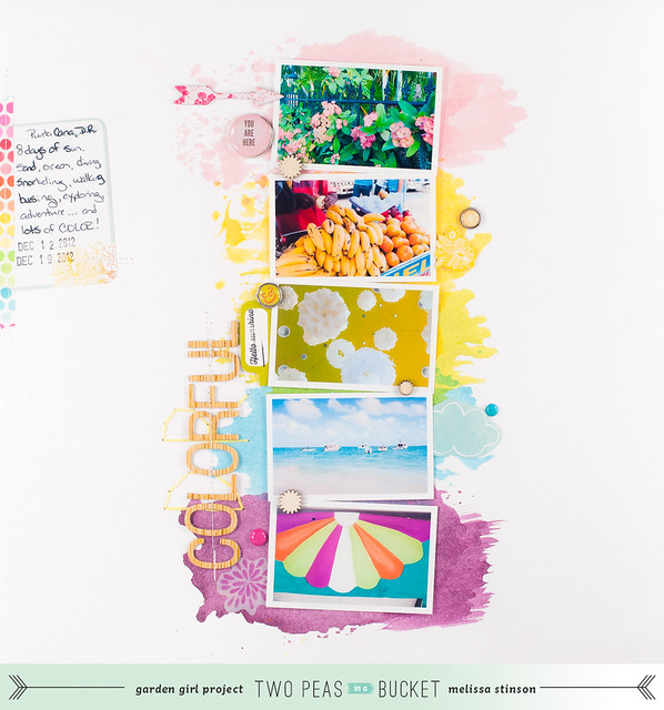
You see, the Garden Girls' April pages are all centered around the theme of "color" this month, with some of the girls doing monochromatic layouts in different colors of the rainbow while others focused on specific color groupings. I was assigned brights and immediately went off to browse my favorite new board on Pinterest, Simply Inspiring, which, while it claims to be a "a hodge-podge of images that I find lovely to look at" is really my "I want all the things!" board. Lately I've had more luck with simply pinning any image that makes me want to go make something to this board, rather than categorizing everything. I love being able to scroll through and see it all together!
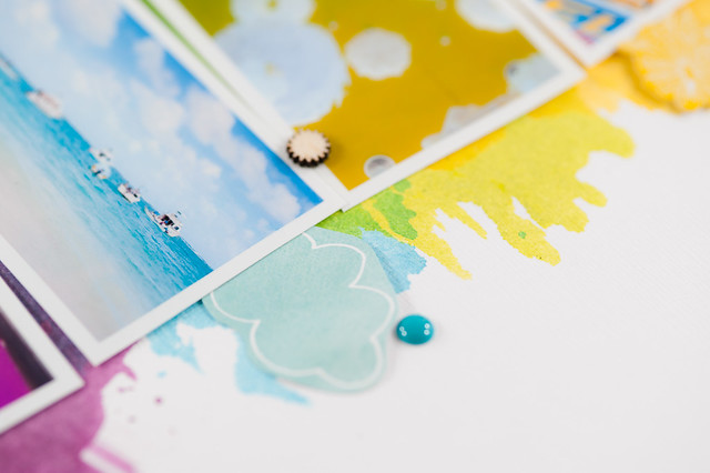
Immediately a couple of watercolor images jumped out at me, and these eventually took the form of painted-on color mists in the spots where pattern paper would normally have taken up residence on my layout.
And my "sketch" came from...wait for it...a platter of fruit!
Yes, I did just say fruit. On a platter. I loved the rainbow stripes, so I mentally flipped the image on its side, combined it with the watercolor-y bits, and came up with this layout:
Supplies:
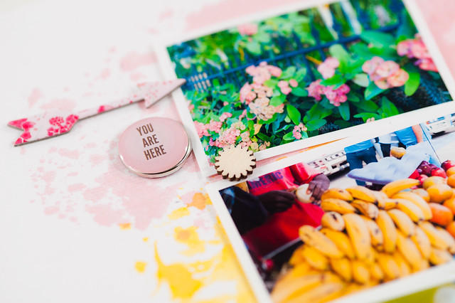
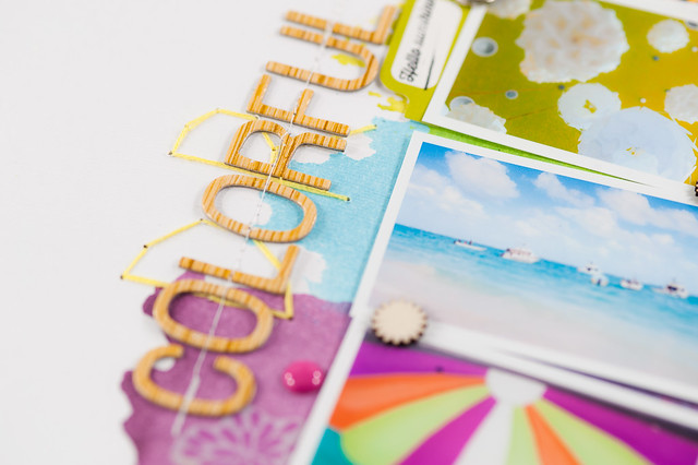
The page looks terribly simple on the computer screen, but in real life the background cardstock is a bit buckled and warped from the watercoloring, and it just has this lovely dimensional feel to it. Photographed it just looks flat...and like it took 30 minutes instead of more than 2 hours! I never worried about how long it was taking me, though- I was having too much fun with the new misting technique that I learned from Janna's video in February!
You can read more about this layout and my design thoughts behind it here at Two Peas in a Bucket.
I've got just one funny little thing about this page to share before I go. Darren walked into my office while I was working on it, at the point where I already had the watercolor blocks down and the photos arranged. I was piecing in the brads and little fiddly bits next to the pictures, and he asked if I was going to leave the white space on either side. I told him that I needed to add some journaling in somewhere and was considering an embellishment cluster at the top left and bottom right...and he said he really liked the white space. He rarely ever has an opinion about these things, so I decided that white space it was and added in just the tiny amount of stuff needed to get my journaling in place and grounded. All that empty space made me a bit nervous at first (or perhaps it was the lack of patterned paper!), but I really do love how it turned out!


