
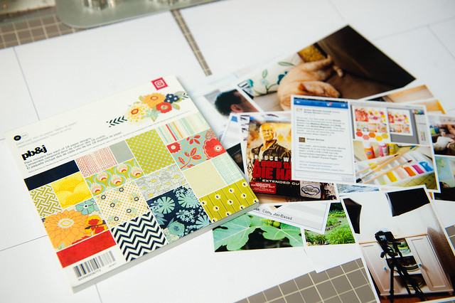
Supplies:
I pulled out one of those pads- the PB&J collection from Basic Grey- out of the cart and used it when putting together this week's Project Life layout. It came together so quickly and easily (and I used lots of older stash to boot!), and I snapped a few photos along the way to show my process for going from a 6x6 pad to a completed Project Life spread in about an hour.
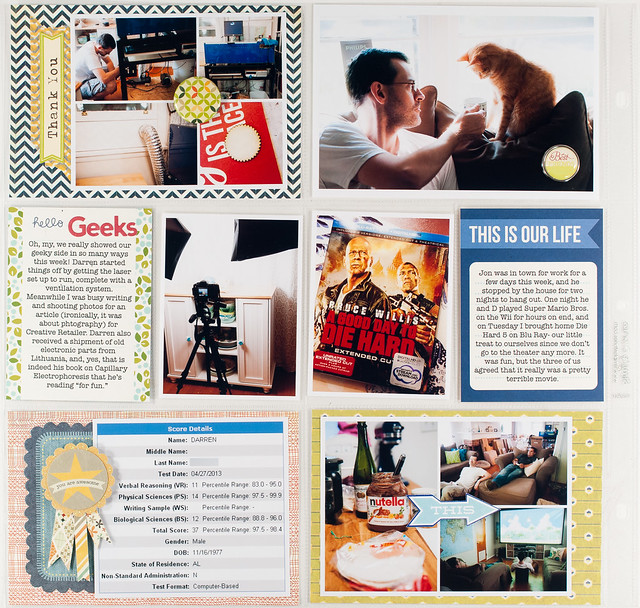
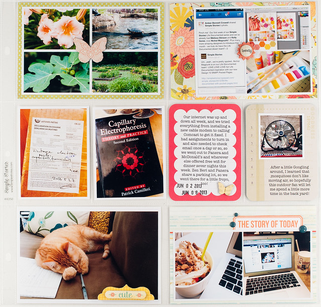
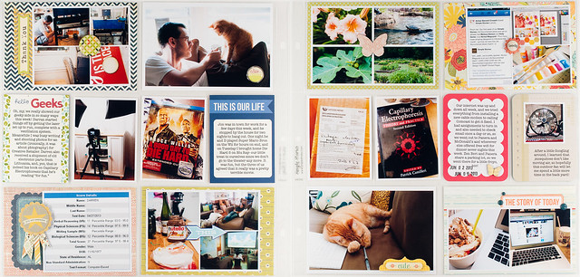
I start by trimming all of my printed photos, then lay them out and select a 6x6 pad that goes best with the colors that are most dominant in them. There's always a mix of colors since they're all everyday photos, but usually a few colors seem to be more prevalent. For this particular week I had lots of red, blue, and green, so PB&J was a perfect match.
Next I lay out all of my photos in their slots and fill in any 4x6 pockets that don't have a full-size photo with background papers cut from the 6x6 pad. If I have any 4x6 pockets that are empty (none for this week!), I'll usually leave them that way until it's time to choose journaling and filler cards.
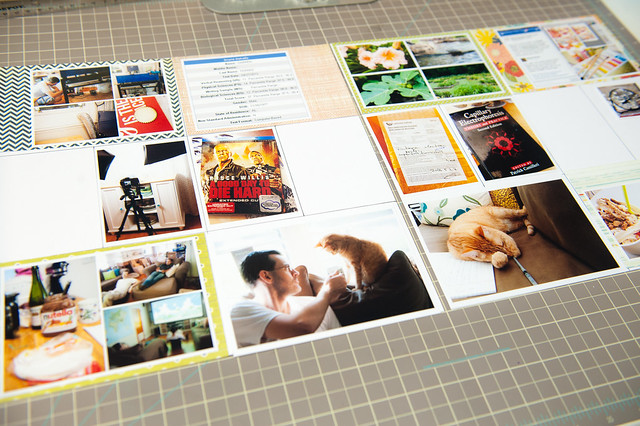
Speaking of journaling cards, those are next! I keep my 3x4 and 4x6 cards sorted by color, so it's really easy to quickly look through them and pick out a few that match whatever 6x6 pad I happen to be using. In this case I found four cards in red, green, and blue shades that worked well with PB&J.
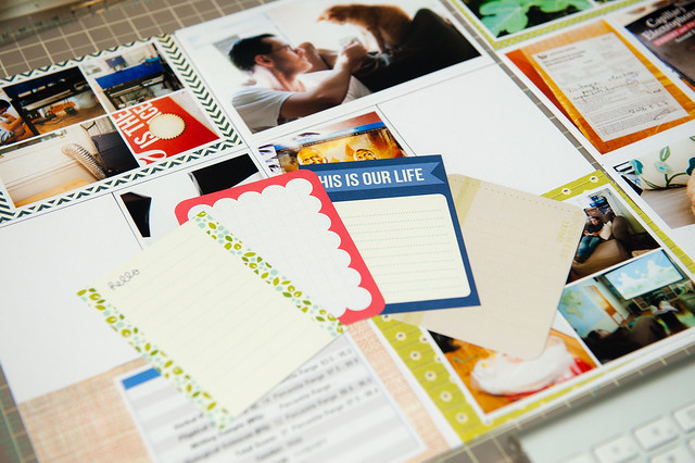
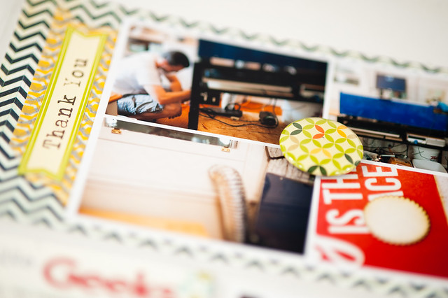
After I've printed up my journaling for the week, I move on to the final step- adding some finishing embellishments. I keep most of my embellishments sorted by color, too, and it usually only takes a few minutes to rummage through the drawers and find pieces that will work with the papers and journaling cards I have picked out.
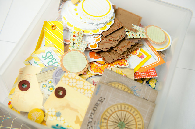
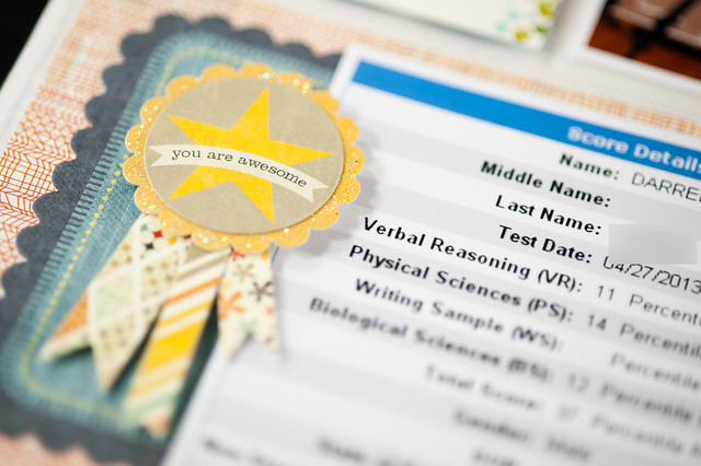
When I first started sorting by color, I was a little nervous that I would miss having everything packaged up by collection, but I've found that I make combinations this way that I might never have before. For example, that "You Are Awesome" ribbon from Pink Paislee's older Prairie Hill collection is something that might have gone completely unnoticed for this layout if I hadn't separated it out from the rest of the pieces in the pack (for self adhesive items like this, I simply cut the backing sheet apart) and stuck it in the "yellow" drawer.

And that's my no fuss, no stress way of mixing and matching my stash in Project Life- and actually for my regular layouts, too!