scrapbook circle layout | aquarium
Tuesday, February 14, 2012
There's a new feature in town over on the Scrapbook Circle blog, and I'm totally digging it. It's called Take Two, and it's a chance for the design team to choose a layout that they made for a past kit and redo it with the current one.
Hello, did someone just say that it was cool for me to scraplift myself? For an assignment? Sweet! I'm all for reusing work. Really, I'm all for anything that makes my life easier, as long as it's legal. And I might even be flexible on that if you catch me on the right day...
My first contribution to the series went up last week, but I always like to bring my "traveling" layouts home to live on the blog as soon as I can. Incidentally, I think this is my first share with the fabulous new kit. I even used it to make cards that aren't hideous, which is a huge accomplishment for me!
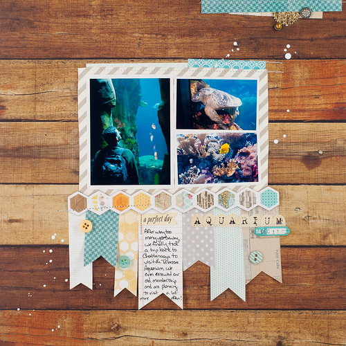
I'll share the (happily non-hideous) cards later this month, but today it's all about this page!!
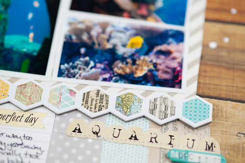
I've had these photos from our trip to the Tennessee Aquarium last December printed and ready to scrap for a few weeks (I even thought I might get them done as one of my CHA layouts for Bella or Pink Paislee), but the right supplies just didn't come along until this kit. I'm so glad that I waited, because it's a perfect fit!
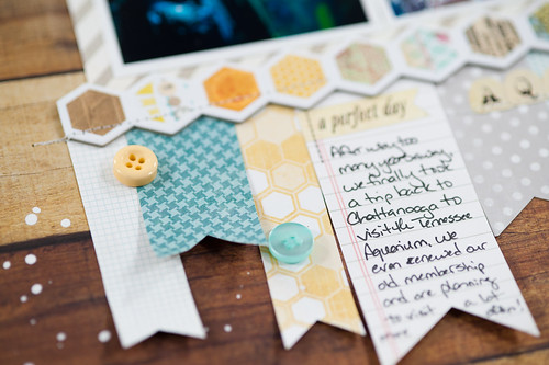
And, in case you're wondering, I based the design off of this layout that I made with last month's kit. I kept the centered design and the banners under the photo block, but changed some of the other elements up.
See what I mean about the kit being fabulous? I love how Lisa chose that October Afternoon Sasparilla wood paper to contrast with the Be Amazing elements by Rhonna Farrer (from My Mind's Eye).
Stay tuned throughout the month as I share more of my kit layouts!


