Usually I love challenges. Usually I love picking my own challenges. When you're on a design team, though, you don't always get to choose your assignments. Bethany and Meridy do a great job of coming up with mini-challenges for the Counterfeit Kit blog- I can't imagine the pressure of coming up with three new ideas every month- but invariably some of them just suit my scrappy personality more than others. It's not a knock against the challenge by any means, it's just the way life is.
This month the first mini challenge was to create a layout based on an ad- any ad, print or video. ::gulp:: This is one area that I've always been "challenged" in- taking some abstract piece of inspiration and basing a layout on it. It makes my brain go wibbly wobbly, and I never know where to start.
So I decided to start here, with this ad for Microsoft, which had one thing that I loved- tons and tons of white space- so white, in fact, that it blends right in with my blog background. White space is my safe place. :)
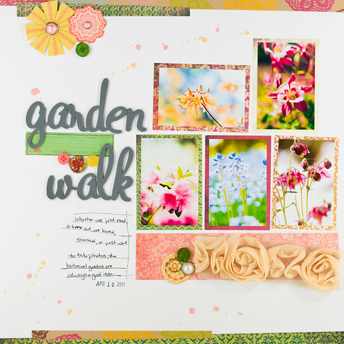
And then I tried and tried and tried to produce a layout that used the same general element placement, and of course the finished product came out looking nothing like the ad. ::sigh::
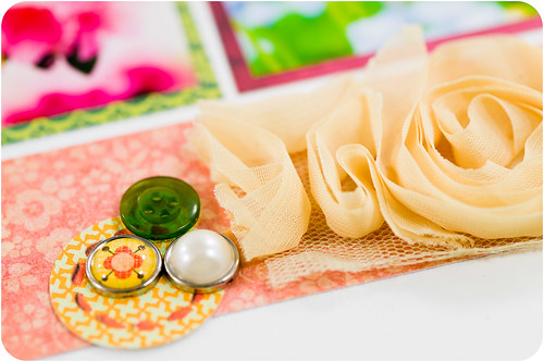
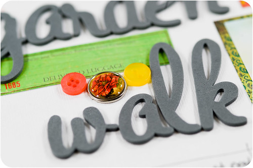
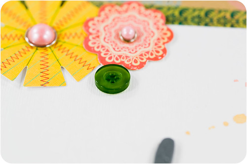
Supplies | Patterned Paper: American Crafts, My Mind's Eye (Stella and Rose), Basic Grey (Hello Luscious); Cardstock: Bazzill Basics Paper (Avalanche); Buttons: Papertrey Ink; Brads: My Mind's Eye; Letter Stickers: American Crafts; Sticker: Crate Paper; Paper Flowers: Sassafrass; Color Mist: October Afternoon Sprinklers (5 and Dime); Ribbon: American Crafts; Date Stamp: Office Supply; Pen: Zig Millenium
I promise I really did try, though!! And, hey, at least the white space is there...sort of.
Mmmm, these brads from My Mind's Eye look so yummy- like little candy bits!
Even though I failed kinda miserably at following the ad, I did come out with a finished layout that I love. And in the end that's what counts, right? Yeah, I'll just keep telling myself that... ;)


