The wackiness of this post and the project I'll get to in just a minute started last Friday when I spotted a fab color combination on The Sweetest Occasion (I adore that blog!) and instantly had that feeling that I had to design a layout around it. And with this palette of neon yellow, lime green, and aqua, can you really blame me? (I'll admit, I've got a full-on obsession with neon and white going right now.)
::image credit::
The only problem was that I didn't really have any photos on hand that I thought would really work with this color scheme, and I'm not a fan at all of converting my photos to black and white to make them match products. I had recently eaten lunch at a place, though, that I knew would produce the perfect photos for the page, so I shot Darren a quick text message to ask if he wanted to have lunch at Lime Fresh Mexican Grill on Saturday (and of course he was totally up for it). That's the first wacky part of this whole story- yes, I did indeed plan a weekend lunch around my need for photos.
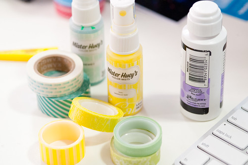
Lunch was had, photos were shot, and shortly thereafter I sat down to work on my page. Now, Lily Bee doesn't exactly have any neon prints in their paper lineup, but there are plenty of yummy lime greens and aquas to go around. In fact, Lily Bee is one of my favorite manufacturers to turn to when I need to work with papers purely on a color basis (you can read more about that and see the whole rainbow of Lily Bee's releases from the last CHA here). Within a few minutes I'd pulled several sheets of aqua and green paper that I thought would work, along with a selection of washi tapes (some neon and some just really bright) and a couple of the brighter (but again, not really neon) shades of Mister Huey to help things along. I ended up not using quite everything that I pulled out, but I wanted to err on the side of having too much in front of me rather than end up not using something just because I'd forgotten that I had it.
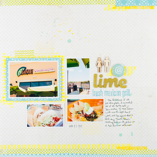
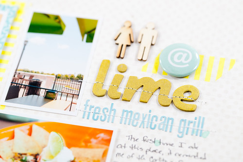
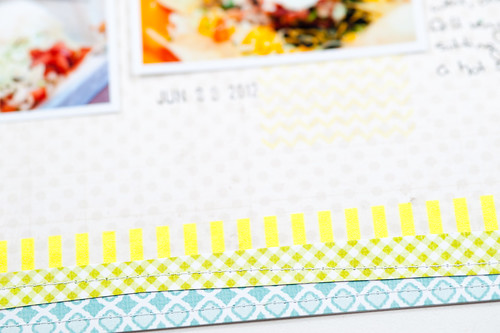
A little while later (with the addition of some Thickers and a few Studio Calico embellishments), this layout was born. It's not quite as bright and day-glo as the inspiration image, but I wasn't really going for full-on neon- just a little taste (which the Heidi Swapp washi provided rather nicely).
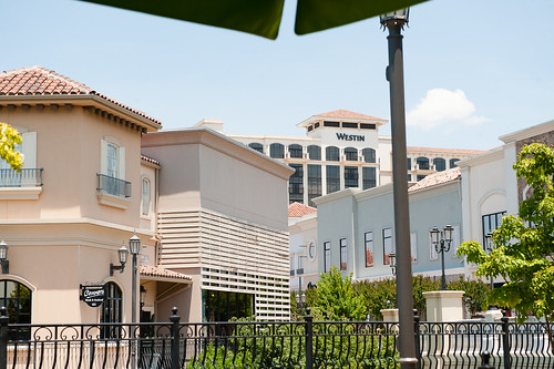
Okay, so now for wacky part number two of this story. Lime Fresh (or is it just called Lime?) has this very Miami/South Beach vibe about it (which is expected since they originated in, well, South Beach). In fact, sitting out on the patio under an umbrella on a hot summer day (we're having temperatures at and above 100 degrees Fahrenheit at the moment), you'd swear you were eating at some place straight out of a scene from Burn Notice. In fact, I said as much to Darren, who very nonchalantly replied, "it's no wonder you think that- Westen's right over your shoulder." I was puzzled for about 3.2 seconds until I remembered that the Westin hotel was indeed right behind me, visible just over my shoulder from where we were sitting. Ha! Funny boy.
I'm convinced that strangers would have one of two reactions to spending any amount of time with us. They would either a) join in with the wackiness and just roll with it or b) run screaming in terror. I tend to think that b would be the more popular choice...
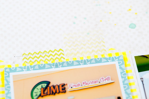
Anyway, getting back to the layout- I wanted to point out a few little details. Like the washi tape frame behind the aqua paper that shows just a little peek of neon without it being overwhelming. The stamped chevrons help, too, and are inked with a very bright (but not neon) shade of yellow (Daffodil) by ColorBox. Though if you're into neon inks, you might want to...ahem...check back here in a couple of weeks...just sayin'. ;)
I could not for the life of me find a shade of letter stickers that I liked for my main title. I wanted a sort of chartreus-y lime-y green, but everything I had was way too green or just the wrong shade altogether. Then I remembered a post on the Studio Calico message board by Kinsey Wilson a few months ago when the new Mister Hueys were released...she'd discovered that if you misted bare chipboard (like the Hatbox chipboard Thickers below) with the Taxi (bright yellow) Mister Huey, they would indeed turn a sort of chartreus-y lime-y green. So perfect! Thanks, Kinsey!
And now that I've made you sit through all my ramblings, it's time to get to the giveaway, right?
I mentioned earlier this week that the Lily Bee blog has a new home at http://www.lilybee.typepad.com/...
...and in celebration of that, Lily Bee is giving away a fabulous prize. It's not paper or stickers or stamps...instead, they're giving one lucky winner a $50 Visa gift card to spend however they would like! To enter, you need to leave a comment on each hopper's blog and on the main Lily Bee blog (that's a lot, I know- I'm sorry, I didn't make the rules this time :(, usually my giveaways are really simple). Comments will close at midnight on July 2nd, 2012, and the winner will be announced on the Lily Bee blog on July 4th, 2012.
Cindy Liebel's blog is the next stop on the hop, and she's got another fantastic (though perhaps slightly less wacky than mine) project to share with you!
Supplies (click on images for product links):


