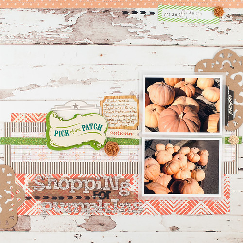
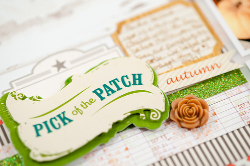
I'm back today with another layout from my guest design spot this month with Citrus Twist kits, and there's also a video to go along with it! For this page I went just a bit outside my usual comfort zone and used larger pieces of patterned paper and also more and larger embellishments than usual. That combined with the patterned background paper made for a layout that is quite a bit busier than my normal pages, but with such fun papers and elements in the kits (I mixed the add-ons and main kit together for this one), I couldn't help myself!
Here's the video of the entire layout being put together (if you subscribe to my blog in email and can't see the embedded clip below, you can click here to see it on You Tube).
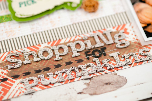
Right up front in the video you'll see me going back and forth with the available letters in the Thickers set, trying to find the right configuration of upper and lower case letters that would spell what I wanted. I ended up changing my title a bit from what I originally intended and included a funky mix of upper and lower case letters, capitalizing some letters in the middle of a word. I love mixed-case alphabets, but for longer titles they're sometimes a challenge to work with!
The Citrus Twist design team has been filling up the gallery and blog with some great inspiration using the November kits, and I encourage you to check it all out!


