I decided to throw down a two-page layout while I was working with the February kits from Citrus Twist, using another stack of my photos from Star Wars Celebration VI. It's been a while since I made a two-pager, and I decided to take some photos of my process as I went along!
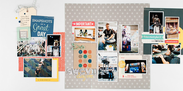
Before I dive into that, though, here's a peek at the finished product:
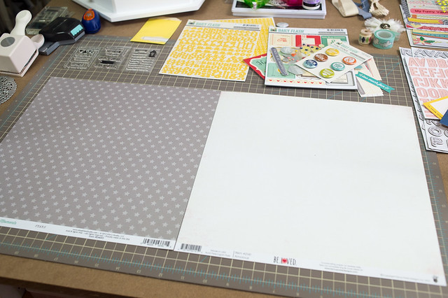
After choosing photos for this page (meaning I simply pulled a pre-printed stack out of my photo storage binder), I started my design by deciding on a layout background. I loved the way the star-printed paper from Elle's Studio looked next to a piece of white cardstock, and I really do like making two-page layouts where each side has a different background. I realized, though, that it would look very similar to the background of another two-page layout that I made for Two Peas last year, which wasn't a huge deal, except they would both end up relatively close to each other in the same album.
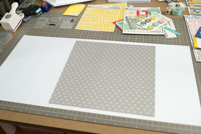
I changed things up by using two sheets of white cardstock instead. I cut the gray star paper down to 11.5" x 11.5" inches and placed it so that roughly 2/3 of it overlapped the right side of the layout, with the other third on the left.
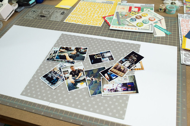
Placing the photos is the next part of my design process, and it's usually the part that a) takes the longest and b) can sometimes be a source of frustration if I can't get a design to work. I don't pre-plan photos and sizes before printing, and in fact when I originally sent these off to the developer, I'd envisioned them on 4-5 layouts of their own, using just 1-2 photos per page. I was really winging it to use these all together, but that's just how I roll with a two-page layout! The best advice I can give you if you want to similarly fly by the seat of your pants is to make sure to print a variety of sizes, mixing small, medium, and large, and to throw some squares in with all the rectangles. I wish I had done that here, but I worked with what I had.
Sometimes with a two-page layout I design on a line, much as I did with that layout that I referenced earlier. Other times I start in the middle of the page and work my way out, balancing things so that one side has a few more photos than the other, both to add some interest and also because the emptier side is usually where the title and journaling ends up, so it's all balanced in the end.
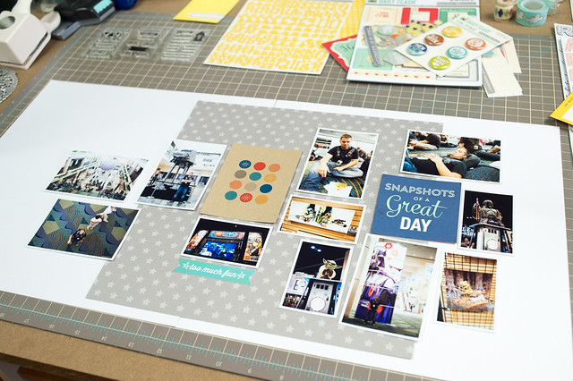
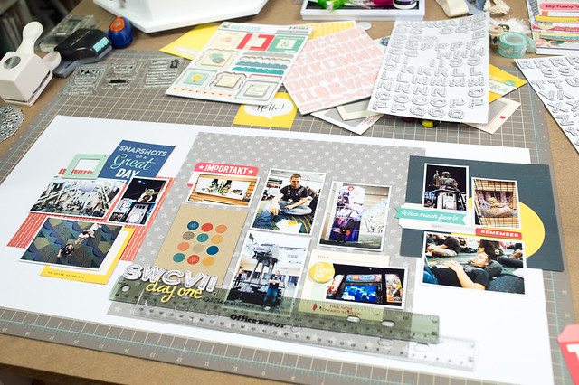
The photo above was my first shot at laying things out, and you can see that I've already identified a few embellishments and paper pieces that I want to use. This part of the process is really a lot of back and forth of trying to make some sort of a loose grid with my photos, knowing that I'll fill in any awkward gaps with more patterned paper and embellishments.
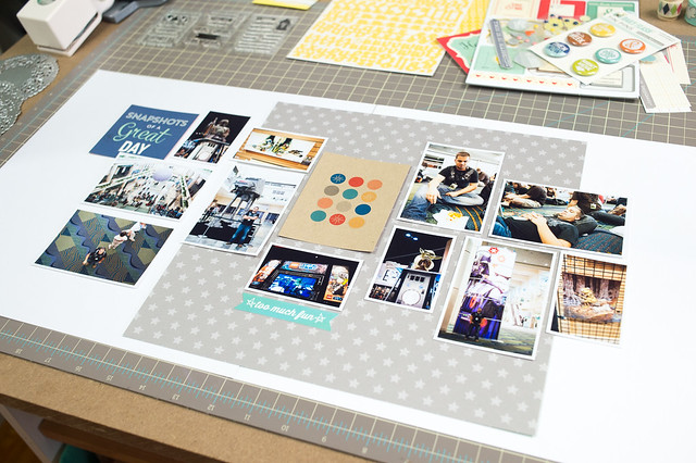
For my second run at a photo arrangement, shown above (as I'm working I take photos of each arrangement with my phone so that if I decide that I really did like one, I can always go back to it) I went with an approach that was a little more linear, but something still just wasn't gelling for me, so I gave it one last shot.
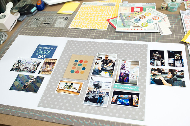
For this third (and ultimately final) arrangement, I split the photos up into three different groups, spaced across the page. I've used a similar type of grouping before, though with a slightly different background, on yet another layout for Two Peas- Merry Halloween. On that page I used the three different groupings to show the three different steps of our pumpkin carving exploits. On my current layout the photos don't have any real reason to be in groups other than I thought that the shapes worked well together, and the photos are all from the same day. You could also use this same grouping technique with more than three groups of photos- it's a really flexible arrangement.
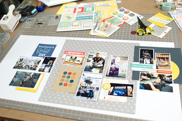
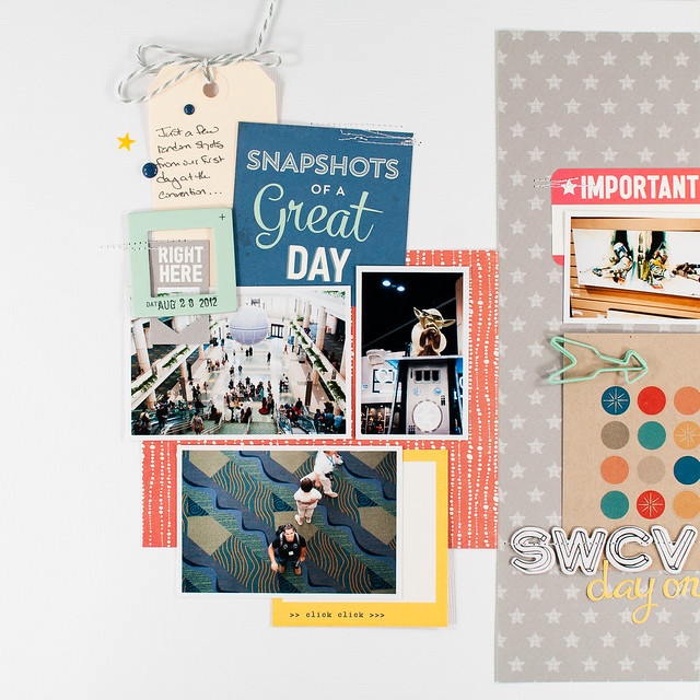
With the photos in place, it was time to start adding in more patterned paper and embellishments. In the photo above I've added a sheet of blue paper from the Citrus Twist Pocket Life kit's 6x6 paper pad, along with several small pieces from an October Afternoon cut-apart sheet and some die cuts from an Elle's Studio pack. In the photo below I've added another sheet from that 6x6 pad- this time in red- on the left page and have also added a title and started an embellishment cluster on the top left.
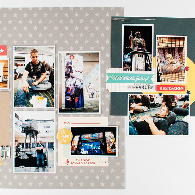
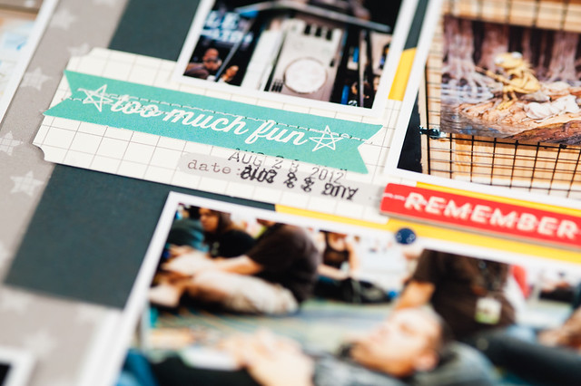
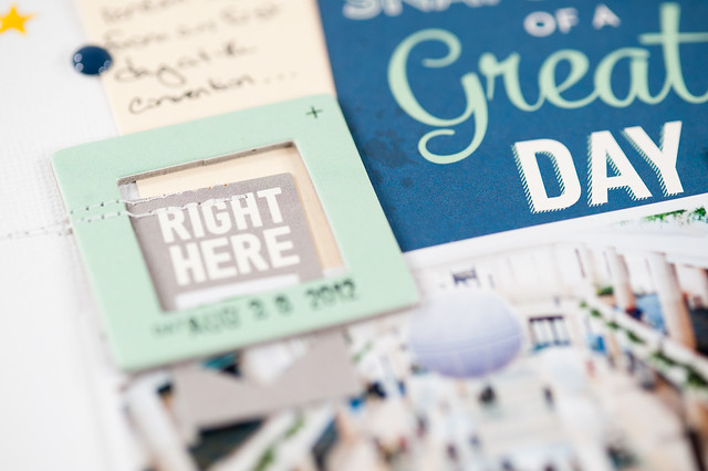
Once I have my photos in place, you can see that the final parts of the layout come together really quickly! I queued off of the circle print 3x4 card for my colors and tried to make sure that I included bits of aqua, red, blue, and yellow in all three sections of the layout to help with the balance.
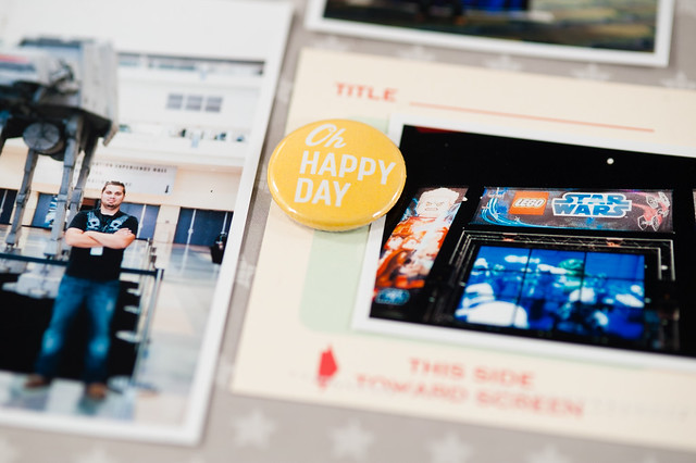
Here's a closer look at the left and right page, along with some detail shots.
And that's how I go about making a two page layout! I used to find them intimidating, but I've learned in the last year or so of making them on my own (that is, without sketches), that the key for me really is a variety of photo sizes and just finding a photo arrangement that I'm happy with. I think if I tried to actually sit down and plan photo sizes for a layout before printing I wouldn't be nearly as happy as I am with this method, so "winging it" it is going to continue to be my go-to process!

