
This morning I'm popping in with a layout instead of the usual Monday Project Life page. I could tell you that the schedule change is because I ended up making an extra Pink Paislee layout for their blog this weekend (I filled in a last-minute spot when a team member had a family emergency) and this was the only free day in my own blog schedule I could make to share it before the end of the month. That actually is true, but in the spirit of keeping it real, I have to admit that I'm actually a little behind on assembling my Project Life album at the moment.
Note that I said behind on assembling, but not on the project itself. I loved Monica McNeill's post in January on defining your level of success with Project Life. While my end goal is a completed album, I consider myself to be doing well if I have all of my photos printed (or in my current case ready to be sent off to Snapfish for printing) and memorabilia corraled in 8.5x11 page protectors in my Project Life album, sorted by week. Most of the time these days I work on Project Life when I crop with the girls at church once a month, so having all of that stuff sorted and ready to go means that I can just sit down and work on it (and usually get 3-4 weeks done at a stretch) when I'm ready. Basically, I make sure the not-so-fun part (printing and sorting are not my faves) is out of the way so I can enjoy the really fun part when the time comes. Lisa Truesdell also has some excellent advice on catching up with Project Life in her latest 2012 Captured lesson from her ongoing class at 2Peas.
So, next week I'll be back with Project Life, though it will be on Tuesday instead of Monday since I've got a Lawn Fawn layout for their upcoming inspiration week that needs to go up then. And this is why I have to keep my blog schedule in a Google Documents spreadsheet!
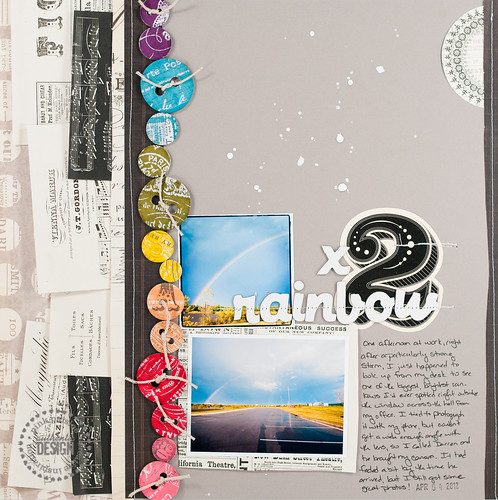
But this is a Pink Paislee post and not Project Life, right? So let's take a look at the two "Hot Products" that I was asked to feature on this page- the Collage Sheets and Chipboard Buttons from London Market.
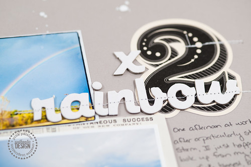
Now, I'm sure you've seen lots of London Market projects since this collection was released (I shared a mini album made with the collection last month) and are used to the soft color palette filled with greens, pinks, and aquas, right? So what's up with the riotous rainbow of color going on up there? Could that even possibly be from the same collection?
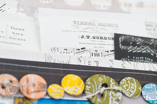
The answer is most certainly yes, and there are two reasons this layout can pull off such a bold look while using London Market. The first is the inclusion of lots of neutral elements. Notice that I did pull in a patterned paper from the line on the left side of the page, but I made sure to use a neutral gray. The two little strips of paper to the right of the Collage Sheet border and on the right-hand side of the page are also neutral. Oh, and the Collage Sheet border itself? Yes, also neutral! With this base of colors-that-work-with-anything, I was free to go nuts on the most vivid portion of the page...
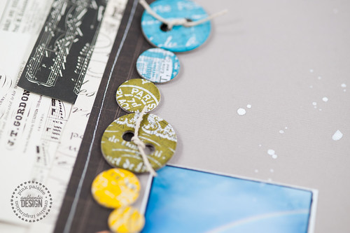
...the buttons! The London Market Chipboard Buttons come as plain white bits printed with resist ink, so you can make them any color you choose. I dove into my stash of Tim Holtz Distress Ink pads by Ranger and chose seven hues (two of them are from the limited edition Halloween and Christmas sets released last year and might be a bit hard to find now if you're looking), then inked two buttons in each color and arranged them in ROYGBIV order to form a rainbow, then tied them off with just a bit of the new Lawn Fawn trim (love that stuff- just the right weight and thickness!).
The photos are from the random rainbow story I shared last Friday. I said then that I'd be getting these scrapped soon- I just had no idea at the time how soon it would be!
Supplies (click on images for product links):