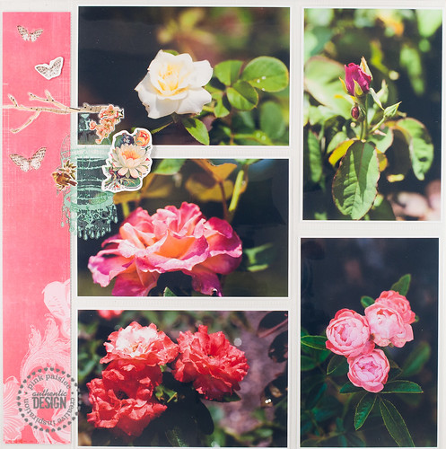
pink paislee layout | roses at leu gardens
Thursday, March 29, 2012
A couple of weeks ago the Pink Paislee blog took an entire week to focus on layering, so the majority of this post is a direct copy of what I wrote over there (no sense in reinventing the wheel, right?). I tend to mostly layer with paper, but there are a lot of other ways you can add layers to your layouts without adding a lot of bulk. (I tend to make a lot of pages, so bulky = takes up too much space in an album = not good.)
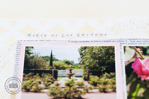
Take, for example, the page above, made using items from Pink Paislee’s new Spring Jubilee collection. Aside from a very few chipboard stickers that are raised up on dimensional adhesive, this page is almost completely flat- yet it still looks quite layered because of all the different textures in play! Let’s take a look at a few ways I achieved this.
I started by misting the background cardstock (using the Mistables mask). The design this step created gives the appearance of depth and dimension, when in reality it added no bulk whatsoever!
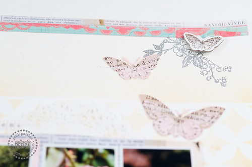
Heat embossing (as shown in the image below) is another great way to add subtle texture to your page. After the heat tool has been applied, the embossing powder takes on a slightly raised profile, but it doesn’t add much dimension. It adds a lot of punch, though!
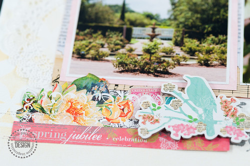
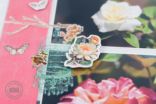
Here I’ve layered several hand-trimmed designs from some of the Spring Jubilee papers, tucking bits of them under the photo mats to create layers. The addition of the chipboard sticker on dimensional adhesive adds a final “pop” to the whole section.
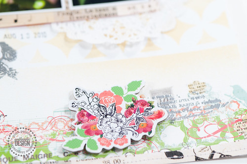
You can achieve that same look with rub-ons, which you can see here layered with more popped up chipboard and also a bit more heat embossing.
Regular layouts aren’t the only place you can employ these layering techniques- I even put them to use in a divided page protector layout I made as a companion to my traditional page.
Nobody said that divided page protector layouts had to be completely flat!! Here I used a rub-on right on top of the page protector, allowing it to span several photos in the pockets below. The addition of another chipboard sticker on dimensional adhesive finished off this simple addition for a simple page, and the two layouts now live side-by-side in my scrapbook album.
I know ::gasp:: no journaling on this one! Thing is, I've scrapped several layouts already about this trip to Leu Gardens in Orlando, and there's only so much you can say about an afternoon spent wandering around looking at flowers. So, yeah, I gave myself permission to just play with photos and paper and pretty products on this one. :)

