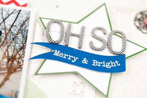
There's a new sketch up on the Pretty Little Studio blog this week, and it was my turn to help provide layout inspiration to go along with it.
I tend to work pretty far in advance on my design team assignments, so I actually made this page a little over a month ago- thus the Christmas theme with Pretty Little Studio's Christmas at Home collection.
This was one of those photos that I've wanted to scrap for a while, but just never really had the right papers until now (it really needed something with a graphic feel and definite blue tones instead of the aquas that exist in a lot of Christmas collections- not that I don't love aqua!). It's a difficult to little make out what it is from the tiny little web-sized layout picture, but what looks like a mess of branches with my little blue blob of a car in the driveway in the background is actually my husband climbing one of the trees in our front yard to hang Christmas lights for me (in the mess of branches with my little blue blob of a car in the driveway in the background).
I love Christmas lights. Darren hates hanging Christmas lights on the house. We compromise by hanging all of the lights (really, there aren't a ton) in one tree in the front yard along with some snowflake lights as a sort of miniature homage to my favorite part of the Galaxy of Lights at the botanical gardens. It's easy to put up, easy to take down, and looks really pretty outside the living room window, so it's a win-win for both of us.
Unfortunately most of my Christmas light strands (including the LED snowflakes that were supposed to have a super long life) were dead when we plugged them in this year, so I'm not sure if this lighting tradition will continue or not. It gets pretty expensive to have to replace lights so often!
Supplies (click on images for product links):


