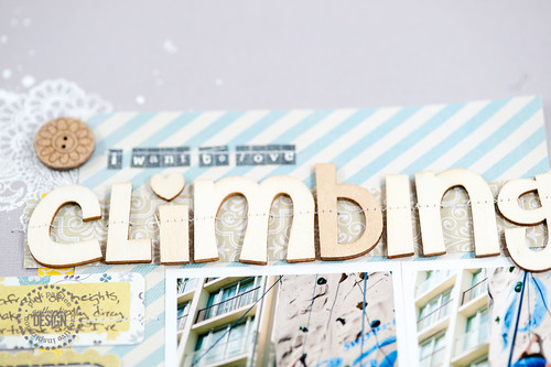
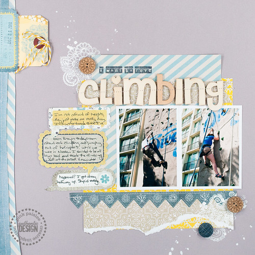
We're getting sketchy over at Pink Paislee, with everyone working off of the sketch by the lovely Valerie Salmon this week. My layout went up today, and I opted to put my own spin on the design instead of following the sketch exactly.
The most notable change that I made to the original design was to use my standard photo size of 4"x3" instead of the 3.5"x3.75" photos indicated. I tend to print lots of photos ahead of time, so using my standard size meant that I didn't have to print new, almost-square photos just for this layout- I find it much easier to flip through my album of printed photos to find two pictures that I already know that I want to use together than it is to scroll through my massive photo library and find two photos in a set somewhere that I think will work well as a pair. Does that make sense? Perhaps I need to write a post about my photo storage binder sometime?
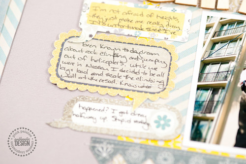
Since I made my photos slightly larger than the sketch specified, they ran into the allotted journaling room, basically squeezing it all out. That was no problem, though, since the design left plenty of empty space to the left of the picture. I simply filled it with a chain of Chat Clouds from Pink Paislee's Indigo Bleu collection to create my own custom journaling spot.
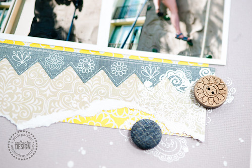
I also played around with the layered papers at the bottom of the photo, replacing the punched strip of paper with a border sticker and adding a chunky hand-torn (I hardly ever do that any more!) strip, too.
I'm curious- how do you all go about using sketches? Do you follow them exactly? Make minor modification? Start out with the indicated design and end up somewhere else entirely? Or maybe you're like me and do any or all of the above, depending on the day, your mood, and the current phase of the moon?
Supplies (click on images for product links):


